Swiggy Delivery Time Prediction
A machine learning project that predicts how long a Swiggy food delivery takes in minutes.
Introduction
Problem Statement
This is a regression problem statement that aims to predict the time it takes (in minutes) for a food delivery given input feature about the rider, vehicle they own, weather conditions, traffic conditions, location of the restaurant and delivery, etc.
Data
The food delivery data is available on Kaggle. Table 1 shows the entire description of the data.
| Column | Description |
|---|---|
ID | Unique identifier for each delivery record. |
Delivery_person_ID | Unique identifier for the delivery person. |
Delivery_person_Age | Age of the delivery person. |
Delivery_person_Ratings | Average customer ratings received by the delivery person. |
Restaurant_latitude | Latitude coordinate of the restaurant. |
Restaurant_longitude | Longitude coordinate of the restaurant. |
Delivery_location_latitude | Latitude coordinate of the delivery location. |
Delivery_location_longitude | Longitude coordinate of the delivery location. |
Order_Date | Date on which the order was placed. |
Time_Orderd | Time at which the order was placed. |
Time_Order_picked | Time at which the order was picked up by the delivery person. |
Weatherconditions | Weather conditions during the delivery.conditions Fog, conditions Stormy, conditions Cloudy,conditions Sandstorms, conditions Windy, conditions Sunny |
Road_traffic_density | Traffic condition on the delivery route.Low, Medium, High, Jam |
Vehicle_condition | Condition of the delivery person's vehicle.0 = Best1 = Good2 = Fair3 = Worst |
Type_of_order | Type of food item ordered.Snack, Meal, Drinks, Buffet |
Type_of_vehicle | Type of vehicle used by the delivery person.bicycle, scooter, motorcycle, electric_scooter |
multiple_deliveries | Number of extra deliveries handled in the same trip.0, 1, 2, 3 |
Festival | Whether the order was placed during a festival.Yes = Festival dayNo = Non-festival day |
City | Classification of the city where the order was placed.Urban, Semi-Urban, Metropolitian |
Time_taken(min) | Total time taken for the delivery in minutes. |
Table 1: Data description.
As we can see, the data has roughly the following types of input features:
- Related to the ride and rider:
Delivery_person_AgeDelivery_person_RatingsVehicle_conditionmultiple_deliveriesCity
- Related to events:
WeatherconditionsRoad_traffic_densityFestival
- Related to location:
Restaurant_latitudeRestaurant_longitudeDelivery_location_latitudeDelivery_location_longitude
- Related to the order:
Order_DateTime_Order_pickedType_of_order
Business Use Case
Today, many companies, like Swiggy, DoorDash, Uber Eats, Zomato, etc., provide online delivery of food items from various restaurants and kitchens. In this competitive market, on-time delivery is crucial for customer satisfaction, retention, and operational efficiency. All of these directly affect the top line of the company. Hence, companies want to optimize delivery time predictions to improve customer experience by providing accurate estimated time of arrival (ETA) of the deliveries and to manage resources efficiently. Accurate prediction of ETA can also allow businesses to:
- Improve Delivery Efficiency: Identifying factors that slow down deliveries enables better resource allocation, such as more reliable scheduling for delivery personnel.
- Enhance Customer Satisfaction: Reliable ETAs can improve the experience of the customer by reducing uncertainty of the waiting time. This will also reduce the chances of delivery cancellation.
- Optimize Operational Costs: If the model can predict scenarios with longer delays, additional resources like more riders or prioritizing some orders can be allocated.
How Machine Learning Helps?
Enhanced Customer Experience
- Customer Satisfaction and Retention: Delivering on promised ETAs is critical to customer satisfaction. When customers know exactly when their order will arrive, they can plan accordingly, reducing their anxiety over wait times. Reliable ETAs mean customers aren’t left guessing or feeling frustrated, which increases trust and brand loyalty. A happy customer is more likely to become a repeat customer, directly impacting revenue growth through increased retention.
- Improved Transparency: Clear, accurate ETAs improve transparency, a factor increasingly valued by customers. If a delay is predicted due to conditions like traffic or weather, proactive updates to ETAs reassure customers that they are informed. This builds trust and creates a positive brand image, especially important in a crowded food delivery market.
- Reduced Customer Support Load: Accurate predictions minimize delays and the subsequent customer service calls and complaints that typically follow. Fewer service interactions reduce operational costs associated with customer support, allowing the business to reinvest these resources into growth initiatives or new customer service features, like a rewards program or app improvements.
Operational Efficiency for Delivery Management
- Better Resource Utilization: With predictive insights on delivery times, the dispatch team can plan routes and schedules more effectively, avoiding high-traffic times or preparing for weather disruptions. For instance, if peak traffic density is predicted, drivers could be assigned specific zones, ensuring they can make more deliveries in a shorter timeframe. This reduces idle times, maximizes the time each driver spends on productive tasks, and makes the fleet more efficient overall.
- Dynamic Allocation: When anticipated delays are flagged in advance, dispatch teams can make real-time decisions, such as reassigning drivers, adjusting routes, or rescheduling specific deliveries to ensure on-time arrivals for high-priority orders. This adaptability in resource management ensures smoother operations and helps the business consistently meet or exceed delivery expectations, even during busy or challenging periods.
- Operational Scalability: As the business grows, knowing the expected delivery times allows for planning more delivery zones or micro-fulfillment centers in strategic locations. This can help scale operations smoothly, ensuring the business meets increased demand without overburdening resources.
Financial Optimization
- Cost Control through Efficiency: Accurate delivery time predictions enable better route planning, which reduces fuel costs, overtime pay, and wear on vehicles. This kind of operational efficiency keeps delivery costs manageable and reduces the cost-per-delivery, which has a direct impact on profitability.
- Minimized Compensation Costs: Predicting delays allows the business to manage customer expectations in advance, avoiding the need for compensations (e.g., refunds, discounts on next orders) due to late deliveries. Lowering such costs contributes to higher profit margins.
- Increased Customer Lifetime Value (CLV): A happy customer who receives reliable ETAs is more likely to order again and again. Over time, this leads to increased customer lifetime value, as each repeat order adds to revenue without the acquisition cost associated with new customers.
Strategic Decision-Making
- Peak and Off-Peak Planning: The model can identify patterns related to demand peaks, like specific times, holidays, or weather conditions that impact delivery time. This information allows the business to prepare, such as increasing driver availability during expected peaks and adjusting promotions or delivery charges in response to anticipated conditions. Properly managing high-demand periods ensures smooth service and maintains customer satisfaction during peak times.
- Operational Flexibility: When data highlights challenging delivery periods, such as during festivals or high-traffic hours, businesses can implement strategies like surge pricing or limit orders to high-capacity areas only. This flexibility helps avoid bottlenecks, ensuring that resources are stretched only to manageable levels.
- Data-Driven Expansion Plans: Insights from delivery time predictions guide strategic planning for geographic expansion or new fulfillment centers. If certain locations consistently show high delivery times, it might signal a need for a local hub to streamline deliveries, improving service without straining existing resources.
Summary
Overall
- Increase customer satisfaction as customers can plan using the ETA of their orders.
- Increases customer trust in company. Clear, accurate ETAs improve transparency, a factor increasingly valued by customers. If a delay is predicted due to conditions like traffic or weather, proactive updates to ETAs reassure customers that they are informed.
- Accurate time predictions reduces chances of cancelled orders.
- Increased transparency can help in lower customer service calls which eases up traffic of complaints those are time related.
- The dispatch team for riders can plan routes and manpower accordingly to serve customers on time.
- They can focus on hotspots in the city which have increased orders at certain time of day, month, year.
- Can help company implement surge pricing in extreme weather or congestion events.
Riders
- Riders can plan pickups and deliveries accordingly.
- They have a foresight of time taken for delivery so can manage multiple orders along the same route.
- Can help in route planning in case of traffic congestions.
- Can do faster deliveries and limit wait times to increase number of deliveries per day which increases their earning potential.
- Drivers do not have to rush or do risky driving during high rush hours as their delivery times are in synchrony with the on ground situation which gives them peace of mind and reduces the chances of unnecessary cancellations and do not impact their ratings.
- Can opt for other providers when demand is less to increase their earnings.
- Can tackle multiple deliveries.
Restaurants
- They can prioritize their orders if delivery times are available.
- They can manage staff to balance out between in house orders vs home deliveries.
- They can prioritize their orders if delivery times are available.
- They can manage staff to balance out between in house orders vs. home deliveries.
- They can scale up staff and resources during events of increased demands.
- Company can also leverage discounts and coupons to increase demand during off peak hours which results in continuous revenue generation.
What Metrics to Use?
There are two metrics well suited for this problem: root mean squared error (RMSE) and mean absolute error (MAE). These are the most appropriate metrics for most regression problems. An added advantage of using these for our problem is that since our stakeholders are the customers, riders, and the restaurants, we want the unit of the metrics to be the same as the output (which is time in minutes). These two metrics satisfy this property.
Say there are a total of \(n\) observations in the training data. Further, say the ground truths of these observations are denoted by \(y_1\), \(y_2\), …, \(y_n\); whereas their predicted counterparts are denoted by \(\hat{y}_1\), \(\hat{y}_2\), …, \(\hat{y}_n\). Then, RMSE is given by
\[\begin{equation}\label{eq:rmse} \text{RMSE} = \sqrt{\frac{1}{n} \sum_{i=1}^{n} \left(y_i - \hat{y}_i\right)^2}, \end{equation}\]and MAE is given by
\[\begin{equation}\label{eq:mae} \text{MAE} = \frac{1}{n} \sum_{i=1}^{n} \left\lvert y_i - \hat{y}_i \right\rvert. \end{equation}\]Now the issue with our data is that due to certain events like extreme weather, holidays, traffic conditions, etc., the delivery time increases significantly and the points become outliers. Hence we want to use a metric that is robust to outliers. As RMSE squares the difference between the ground truth and the corresponding predictions, it penalizes the outliers, making the model give incorrect predictions even for non-outlier points. Hence, we will stick to MAE, which is more robust to outliers as it does not square the difference between the ground truth and the corresponding predictions.
Improvements in Business
Let us now see how creating this model will improve business metrics.
Customer Satisfaction Score (CSAT)
- Impact: With accurate ETAs, customers feel more informed and are less likely to experience frustration from delays or inaccurate delivery windows.
- Measurement: Customer satisfaction surveys or ratings post-delivery. A rise in CSAT often indicates positive customer experiences.
Customer Retention Rate
- Impact: Satisfied customers are more likely to reorder, especially if the delivery experience meets or exceeds expectations consistently.
- Measurement: Percentage of customers who continue ordering after their initial experiences. Improved ETAs help build customer trust and encourage repeat business.
Average Order Value (AOV)
- Impact: When customers trust the delivery process, they may place larger or more frequent orders, especially during promotions or peak times.
- Measurement: Monitoring trends in order value over time can indicate that enhanced delivery service is encouraging higher spending.
Delivery Success Rate
- Impact: Reduced late deliveries and minimized cancellation rates can increase the proportion of successful deliveries.
- Measurement: Percentage of orders successfully delivered within the promised time frame. Lowering cancellation rates or delays directly impacts delivery success.
Operational Efficiency Metrics
- Driver Utilization Rate: Predictive ETAs allow for better routing and delivery clustering, optimizing each driver’s workload.
- Delivery per Hour: Accurate predictions reduce idle time and allow drivers to complete more orders per shift.
- Cost per Delivery: Fewer delays and optimized routing reduce fuel costs, time on the road, and labour costs per delivery.
Customer Support Cost
- Impact: Fewer customers will call support for delivery updates if they have a reliable ETA. This reduces operational costs tied to customer service.
- Measurement: Reduced volume of time-related inquiries and complaints means lower customer support costs, indicating a positive impact from reliable delivery predictions.
Order Cancellation Rate
- Impact: With accurate ETAs, customers are less likely to cancel orders due to long or uncertain wait times.
- Measurement: The percentage of orders cancelled by customers can drop with improved delivery time accuracy.
Flow of the Project
The rough flow of this project will be the following:
- Detailed EDA:
- Check for missing values and duplicates,
- Check for multicollinearity,
- Check for correlation,
- Check the distribution of variables,
- Check the distribution of the target,
- Check for the presence of outliers in the target,
- Feature selection.
- Experimentation:
- Finding the best model using Optuna,
- Tuning the hyperparameters of the best model using Optuna.
- MLOps:
- Experiment tracking using MLFLow,
- Creating a DVC pipeline,
- Containerization using Docker.
Our goal will be to make an API service that serves our machine learning model. We will create an app that will hit this API service, which will predict the delivery time and give it back to the app. The API service will get input data from multiple sources. For instance, it will get get some data from the rider, like rider’s location, rider’s vehicle type, rider’s rating; some data from the customer like delivery location, etc. We can also get other data, like weather, traffic, etc., from some other APIs.
We will use FastAPI to build this API service and test it through Swagger. We will containerize this app using Docker, use continuous integration (CI) for testing, and use continuous delivery (CD) for deployment on AWS. We will use an auto-scaling group of EC2 instances along with a load balancer for deployment. Once it is deployed, we will hit this service using Postman and stress test the load balancer and check if it is able to handle all the traffic properly and if the auto-scaling groups are performing correctly.
Data Cleaning
The data is already messy. So the first this messy data was cleaned to perform EDA, and based on this EDA, further data cleaning was performed. So data cleaning and EDA was carried out recursively and iteratively. Further, we also developed some new features. Let’s go through it one by one.
Basic Data Exploration
Basic data exploration refers to loading the data and just observing a few rows from it. The columns present in the data are mentioned in Table 1. Some notable observations are the following:
- The data has 45,593 rows and 20 columns.
- The entries in the
Delivery_person_IDare of the form"INDORES13DEL02","BANGRES18DEL02","COIMBRES13DEL02","CHENRES12DEL01", etc. We can see that the first 4 characters stand for the city in which the rider is delivering the food. So, we can build a new feature for city using this column. - Next, we have 4 location columns corresponding to the latitude and longitude coordinates of the restaurant and the delivery location. Using them we can find the distance between the restaurant and the delivery location which may help predict the delivery time.
- Next, we have a column called
Order_Date. Using this we can build multiple features, e.g, day of week, whether it is a weekend or not, etc., which can help predict the delivery time. - Next, we have two time columns, namely,
Time_OrderdandTime_Order_picked. By finding their difference, we can find the time it took for the rider to pick the order up. This may again be a useful feature. - Next, we have a column called
Weatherconditionsthat has values like"conditions Sunny","conditions Stormy", etc. We can clearly see the redundant substring"conditions "in the entries, which can be cleaned. - Finally, the target column
Time_taken(min)has entries like"(min) 24","(min) 33", etc. The two problems here are the fact that it is a string, and the redundant substring of"(min) "attached to it as prefix. Both these problems need to be fixed.
At first glance, the following features may have some predictive power to predict the delivery time:
-
Delivery_person_Ratings: A rider with higher rating may deliver the food sooner as compared to the a rider with lower rating. - Latitude and longitude coordinates for the restaurant and delivery location: A delivery involving food from a restaurant that is farther away from the delivery location may take longer as compared to a delivery involving food from a restaurant that is closer.
-
Order_Date: A delivery ordered on weekends may take lesser time due to lower traffic as compared to a delivery ordered on weekdays. -
Time_OrderedandTime_Order_picked: A delivery in which the rider takes longer time to pick up from the restaurant may take longer to deliver. -
Weatherconditions: Extreme weather events, e.g., stormy, sandstorms, etc., may result in longer delivery times. -
Road_traffic_density: Higher road traffic may imply longer delivery times. -
Vehicle_condition: A better vehicle may take lesser time for delivery. -
Type_of_vehicle: Vehicles like bicycle may result in longer deliveries. -
multiple_deliveries: Orders in which riders deliver multiple deliveries in a single trip may take longer to get delivered. -
Festival: Orders on a festival may take longer to get delivered as more people order outside food during festivals. -
City: Food ordered in more developed cities with extensive road network may take lesser time to get delivered.
All these are just speculations right now. We will verify them during EDA. There are also issues with the data types of some columns. To be precise, the columns Delivery_person_Age, Delivery_person_Ratings, Vehicle_condition, multiple_deliveries, and Time_taken(min) are of the type object. We will have to change them to numerical type. We also need to change the data type of all the datetime columns to datetime as they are currently of type object.
Missing Values and Stripping Whitespaces
At first glance, we simply run the following code:
df.isna().sum()
The result suggested that there are no missing values in the data. However, after inspecting the data closely by having a closer look at a random sample of 50 rows of the data using the code
df.sample(50)
we realised that there are missing values, but they are included in some other format. For instance, missing values in the column Delivery_person_Age (which is currently of the type object) has missing values denoted using the string "NaN ". The same is the situation with the columns Delivery_person_Ratings, datetime columns, Weatherconditions, etc. Further, having a look at these individual values also showed that many of the entries in the columns of object datatype have leading and trailing whitespaces. So, we first removed these whitespaces using the following code:
object_type_columns = df.select_dtypes(include=["object"]).columns
df[object_type_columns] = df[object_type_columns].map(lambda x: x.strip() if isinstance(x, str) else x)
Next, we replaced all the strings "NaN" with np.nan.
df[object_type_columns] = df[object_type_columns].map(lambda x: np.nan if isinstance(x, str) and "NaN" in x else x)
Next, running the code
df.isna().sum()
gave us the output shown in Table 2.
| Column | # missing values |
|---|---|
ID | 0 |
Delivery_person_ID | 0 |
Delivery_person_Age | 1854 |
Delivery_person_Ratings | 1908 |
Restaurant_latitude | 0 |
Restaurant_longitude | 0 |
Delivery_location_latitude | 0 |
Delivery_location_longitude | 0 |
Order_Date | 0 |
Time_Orderd | 1731 |
Time_Order_picked | 0 |
Weatherconditions | 616 |
Road_traffic_density | 601 |
Vehicle_condition | 0 |
Type_of_order | 0 |
Type_of_vehicle | 0 |
multiple_deliveries | 993 |
Festival | 228 |
City | 1200 |
Time_taken(min) | 0 |
Table 2: Number of missing values in each column.
The total number of missing values in the data is 9,131. Note that this is not the number of rows with missing values, but the number of missing values in the data.
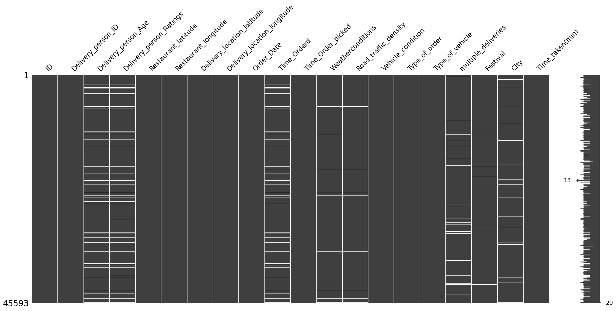
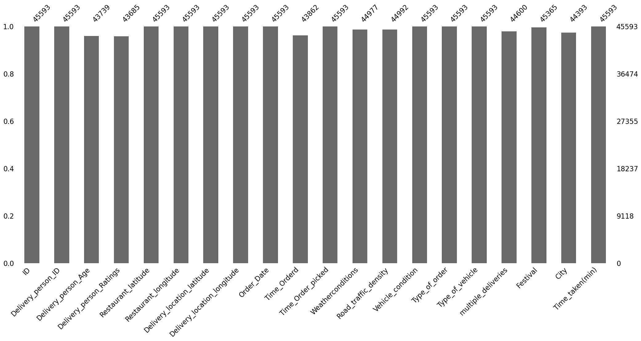
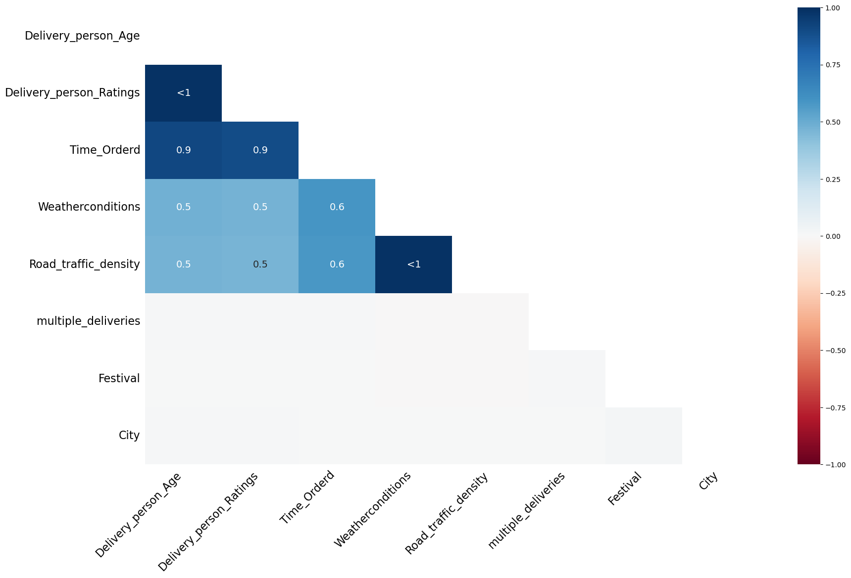
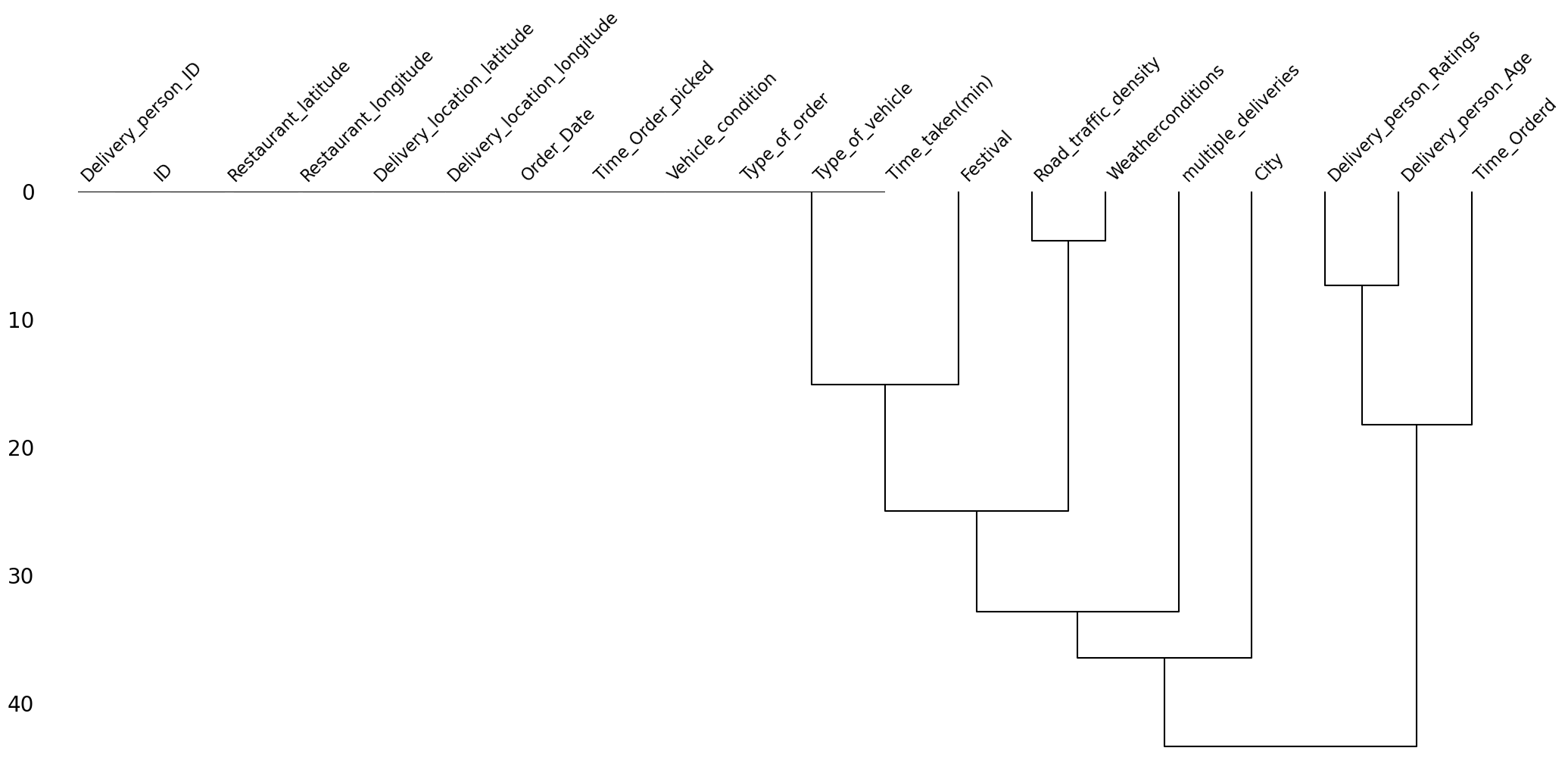
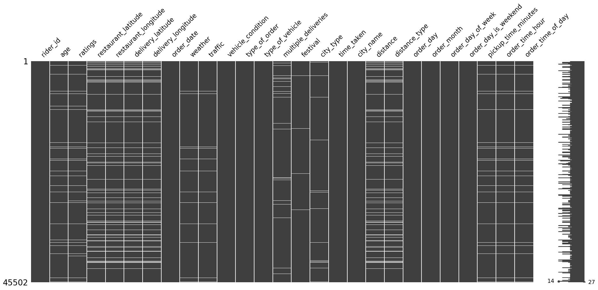
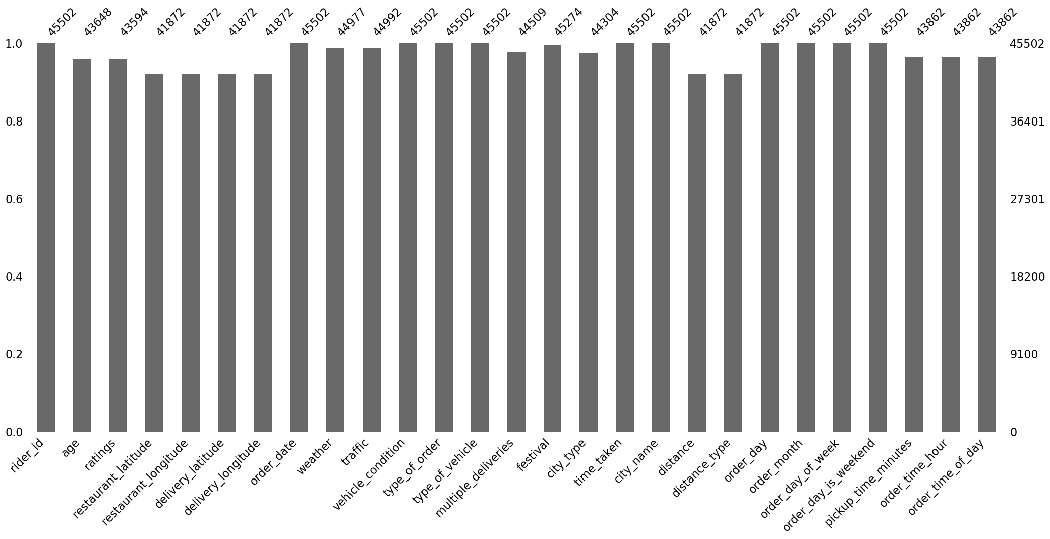
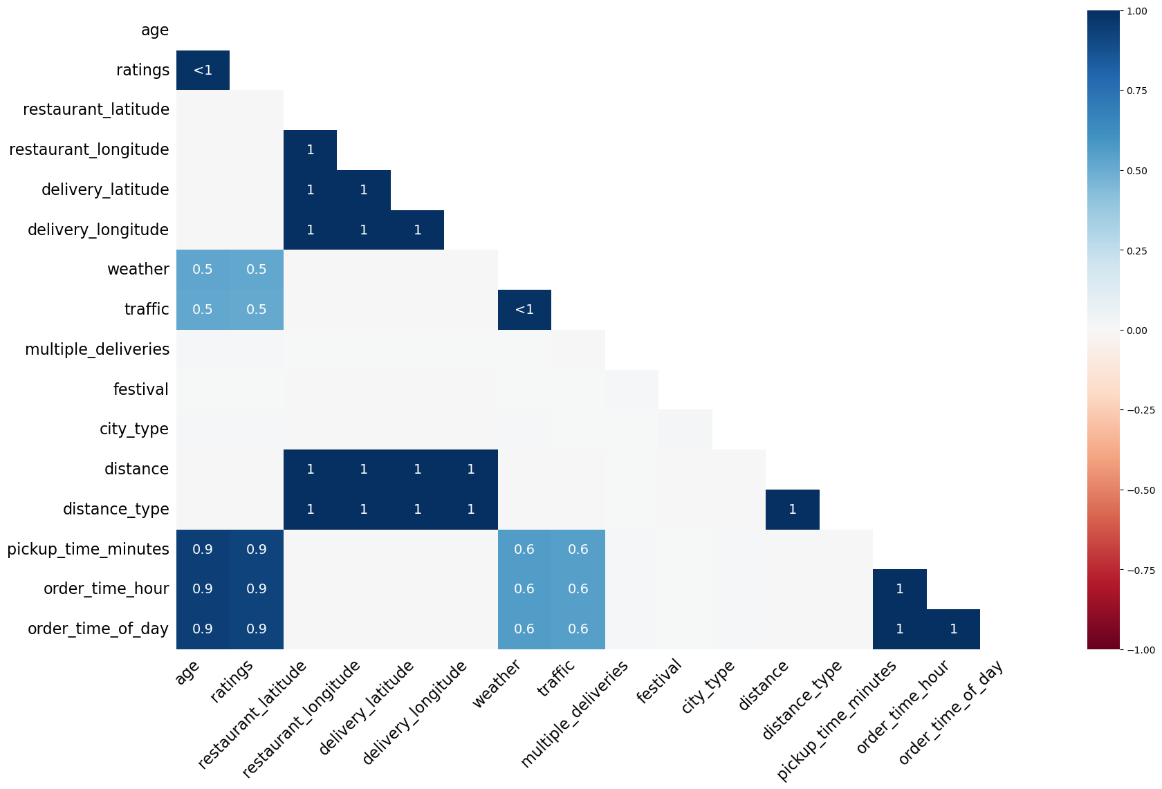
Visualizing Missing Values
We now visualize the missing values using the missingno library.
Matrix of Missing Values
The matrix of missing values is shown in Figure 1.
Count of Missing Values
The bar plot of the count of missing values is shown in Figure 2.
Correlation of Missingness
The correlation heat map of missing values that indicates whether the missingness is correlated or not is shown in Figure 3.
Dendrogram of Missing Values
The dendrogram of missing values is shown in Figure 4.
Observations
The observations from visualizing the missing values are the following:
- The missingness in the delivery person related columns, i.e.,
Delivery_person_AgeandDelivery_person_Ratings, is highly correlated. - The missingness in the
Time_Orderedcolumn is also highly correlated with the missingness of the delivery person columns. This might be due to some network error where the system was unable to log the delivery person details and the time of order. - The missingness of the
Road_traffic_densitycolumn is also highly correlated with the missingness of theWeatherconditionscolumn. - The missingness of the
Road_traffic_densitycolumn is also highly correlated with the missingness of the delivery person columns. This might be because the road traffic density may be recorded using the delivery person’s phone. We need to investigate more on this. - Clearly, the values are missing not at random.
After running the following code
pct = (df.isna().any(axis=1).sum() / df.shape[0]) * 100
print(f"{round(pct, 2)}% rows in the data have missing values.")
we get that there are about 9.27% of the rows in the data have missing values.
Basic Data Cleaning
Stripping Leading and Trailing Whitespaces
We have already mentioned about this. But just for completeness, I will repeat it here. Most values in the columns of the object datatype have a leading or a trailing whitespace. We removed them using the following code:
object_type_columns = df.select_dtypes(include=["object"]).columns
df[object_type_columns] = df[object_type_columns].map(lambda x: x.strip() if isinstance(x, str) else x)
Converting String Encoded NaN values to Actual NaN values
As mentioned earlier, the missing values in the columns of the object datatype are encoded in the string representation of "NaN". We convert it to np.nan using the following code:
df[object_type_columns] = df[object_type_columns].map(lambda x: np.nan if isinstance(x, str) and "NaN" in x else x)
Renaming the Columns
The column names are too verbose. We rename them to have more succinct and meaningful names using the following function:
def change_column_names(df: pd.DataFrame):
    rename_mapping = {
        "delivery_person_id": "rider_id",
        "delivery_person_age": "age",
        "delivery_person_ratings": "ratings",
        "delivery_location_latitude": "delivery_latitude",
        "delivery_location_longitude": "delivery_longitude",
        "time_orderd": "order_time",
        "time_order_picked": "order_picked_time",
        "weatherconditions": "weather",
        "road_traffic_density": "traffic",
        "city": "city_type",
        "time_taken(min)": "time_taken"
    }
    df = df.rename(str.lower, axis=1).rename(rename_mapping, axis=1)
    return df

df = change_column_names(df)
Removing Duplicates
We check if the data has any duplicate rows using the following code:
df.duplicated().sum()
Fortunately, there are no duplicate rows in the data. If there were, we would have just kept their first occurrence.
Column-wise Data Cleaning
We will now discuss what data cleaning steps should be applied on each of the columns. At the end, we will create a function that applies all these steps on the data one by one.
id
This column is of the object datatype, and is actually unique for each row. We found this by running the following code:
print(f"The number of unique IDs are {df['id'].nunique()}, and the number of rows are {rows}.")
and we got the following output:
The number of unique IDs are 45593, and the number of rows are 45593.
So, we can simply drop this column as it will have no predictive power.
rider_id
This column is of the object datatype. We ran the following code to check the number of unique values in this column:
print(f"The number of unique rider IDs are {df['rider_id'].nunique()}, and the number of rows are {rows}.")
The output we got is
The number of unique rider IDs are 1320, and the number of rows are 45593.
This means that there are 1,320 unique riders in the data.
The first few rider_id values are the following: "INDORES13DEL02", "BANGRES18DEL02", "COIMBRES13DEL02", "CHENRES12DEL01", etc. Clearly, the substring that comes before "RES..." stands for the city name of the riders. So, we can create a new column called city_name by splitting the rider_id column on "RES" in the following way:
df["rider_id"].str.split("RES").str.get(0).rename("city_name")
age
This column right now is of the object datatype. We first convert it to float datatype using the following code:
df["age"] = df["age"].astype("float")
Next, running the describe function on it gives us the following output:
count    43739.000000
mean        29.567137
std          5.815155
min         15.000000
25%         25.000000
50%         30.000000
75%         35.000000
max         50.000000
Name: age, dtype: float64
We can see that the youngest rider is of age 15, which is concerning. We can investigate further the type of transport they are using.
Boxplot
Figure 5 shows the boxplot of this column age.
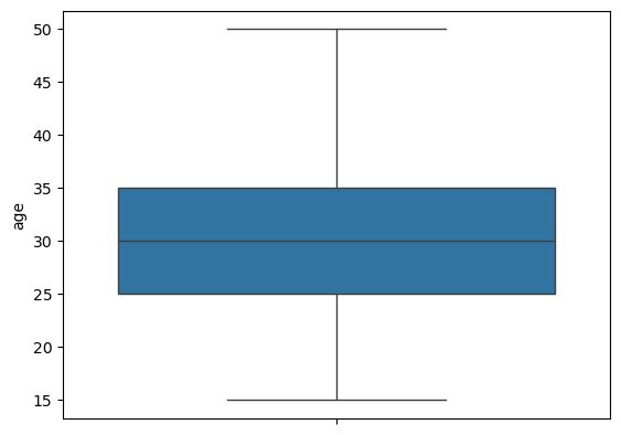
age.We can see that the distribution looks slightly right-skewed with no outliers.
Minors
We will now investigate all the riders that are minors, i.e., riders younger than 18 years of age. We create a subset (that contains minors) of our original data using the following code:
minors = df.loc[df["age"] < 18]
There are a total of 38 observations in the data corresponding to minors. Viewing these observations showed us some concerning points, which are the following:
- All the data corresponding to minors have missing values in the columns
order_time,order_picked_time,weather, andtraffic. - Some values in the column corresponding to latitude and longitude had negative values, which does not make sense as India is above the equator and to the east of the prime meridian.
- The rating of all minor riders is the worst, i.e.,
1. - The condition of vehicles they use is the worst, i.e.,
3. - All the minor riders are aged 15, which is below the permissible age to drive a vehicle.
Right now, it seems like removing this data makes more sense and is also easier than fixing it. This is because they have many missing values and faulty data. As these are just 38 rows in the original data, removing them won’t affect the performance of the model significantly.
ratings
We first change the datatype of this column from object to float. Next, running the describe function on this column gives the following output:
count    43685.000000
mean         4.633780
std          0.334716
min          1.000000
25%          4.500000
50%          4.700000
75%          4.900000
max          6.000000
Further, Figure 6 shows the boxplot of this column.
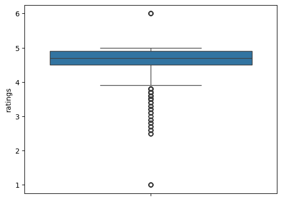
ratings.Observations
- Minors have 1-star ratings, which, looking at the box plot, seem like anomalies.
- The 6-star ratings are not possible. Hence, these are also anomalies.
- Both these ratings need to be investigated. If the data is problematic, then fixing or removing these rows are our options.
Six-Star Ratings
We created a subset of the data with six-star rating using the following code:
six_star_ratings = df.loc[df["ratings"] == 6]
There are a total of 53 such rows. Observing these rows, we saw that they also suffer from the same problems that the rows corresponding to the minors did, i.e., some of the latitude and longitude coordinates being negative, and all values missing in the columns order_time, weather, and traffic. We need to remove such rows.
Location Columns
The location columns are restaurant_latitude, restaurant_longitude, delivery_latitude, and delivery_longitude. The datatype of all these columns is already correct, i.e., float. We now run the describe function on only these location columns. The output we get is shown in Table 3.
| Statistic | Restaurant Latitude | Restaurant Longitude | Delivery Latitude | Delivery Longitude |
|---|---|---|---|---|
| count | 45593.000000 | 45593.000000 | 45593.000000 | 45593.000000 |
| mean | 17.017729 | 70.231332 | 17.465186 | 70.845702 |
| std | 8.185109 | 22.883647 | 7.335122 | 21.118812 |
| min | -30.905562 | -88.366217 | 0.010000 | 0.010000 |
| 25% | 12.933284 | 73.170000 | 12.988453 | 73.280000 |
| 50% | 18.546947 | 75.898497 | 18.633934 | 76.002574 |
| 75% | 22.728163 | 78.044095 | 22.785049 | 78.107044 |
| max | 30.914057 | 88.433452 | 31.054057 | 88.563452 |
Table 3: Summary statistics for the location columns.
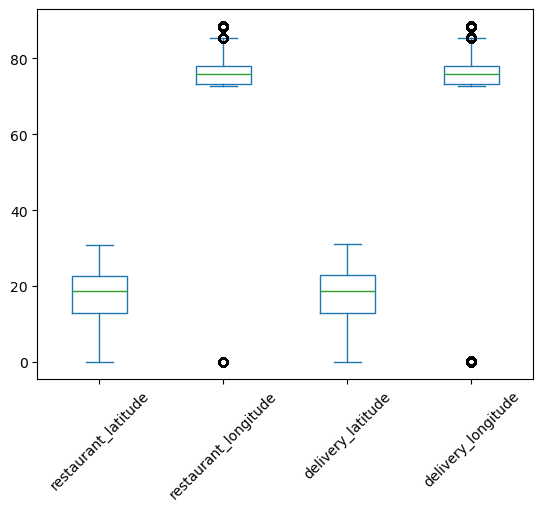
To visualize this distribution better, we plot the box plot of the location columns which is shown in Figure 7.
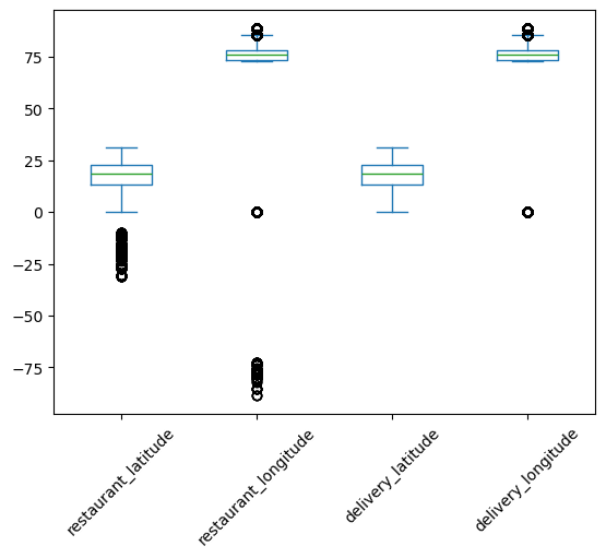
As India lies to the north of the equator between 6° 44’ N to 35° 30’ N, and between 68° 7’ E to 97° 25’ E, the valid values of latitudes and longitudes are only the ones that fall in this range. So, there are some faulty values of latitudes and longitudes in the data. We can see that only the values near the minimum are faulty. The maximum values already lie in the required range. So, we form a subset of the data with these incorrect coordinates using the following code:
lower_bound_lat = 6.44
lower_bound_long = 68.70

incorrect_locations = df.loc[
    (df['restaurant_latitude'] < lower_bound_lat) |
    (df['restaurant_longitude'] < lower_bound_long) |
    (df['delivery_latitude'] < lower_bound_lat) |
    (df['delivery_longitude'] < lower_bound_long)
]
We now plot the boxplot of these incorrect location coordinates, which is shown in Figure 8.
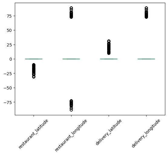
Looking at this box plot, it seems that the negative values may be incorrect only because of their signs. If they were positive, they would lie in the required range. There are also zeros in these columns. One way of handling the zeros is to replace them with np.nan, and then impute them with advanced imputation techniques that use the remaining columns.
Fixing Incorrect Location Columns
We will fix the incorrect location columns by just taking their absolute values. This will convert all the negative coordinates to positive. This will make sure that they lie in the proper latitude and longitude bounds of India. The boxplot of the location columns after taking the absolute value is shown in Figure 9.
This looks good. Next, we also replace the zeros with np.nan. These zeros also lie outside the geographical bound of India.
We create the following common function that fixes all the latitude and longitude columns:
def clean_lat_lon(df: pd.DataFrame, threshold=1):
    df = df.copy()
    location_columns = df.columns[4:8]
    df[location_columns] = df[location_columns].abs()
    df[location_columns] = df[location_columns].map(lambda x: x if x >= threshold else np.nan)
    return df
As we replaced the zeros with np.nan’s, this introduces 3,640 new missing values in the data.
Creating distance using Location Columns
We create a new column called distance using these location columns. This stands for the (haversine) distance between the restaurant and the delivery location. We use the following function to create this column:
def calculate_haversine_distance(df):
    location_columns = location_subset.columns.tolist()
    lat1 = df[location_columns[0]]
    lon1 = df[location_columns[1]]
    lat2 = df[location_columns[2]]
    lon2 = df[location_columns[3]]

    lon1, lat1, lon2, lat2 = map(np.radians, [lon1, lat1, lon2, lat2])

    dlon = lon2 - lon1
    dlat = lat2 - lat1

    a = np.sin(dlat/2.0)**2 + np.cos(lat1) * np.cos(lat2) * np.sin(dlon/2.0)**2

    c = 2 * np.arcsin(np.sqrt(a))

    distance = 6371 * c

    return (
      df.assign(
        distance = distance
      )
    )
Once we create this distance column, we will drop the latitude and longitude columns as they have missing values and there is no way of imputing them since we also have information about cities available. We can, however, impute the distance column using some advanced imputation techniques that uses the other columns.
order_date
This column is of the datatype object. We first convert it to the datetime format using the following code:
df["order_date"] = pd.to_datetime(df["order_date"], dayfirst=True)
As seen earlier, this column fortunately does not have any missing values. Next, we use the following function to create new datetime features using this column:
def extract_datetime_features(series: pd.Series):
    date_col = pd.to_datetime(series, dayfirst=True)
    data = {
        "day": date_col.dt.day,
        "month": date_col.dt.month,
        "year": date_col.dt.year,
        "day_of_week": date_col.dt.day_name(),
        "is_weekend": date_col.dt.day_name().isin(["Saturday", "Sunday"]).astype(int)
    }
    df = pd.DataFrame(data)
    return df
This gives us five new features, which are the following:
-
day: This is the day of the month. -
year: This denotes the year. -
month: This is the month (numerical). -
day_of_week: This is astring, e.g.,"Monday". -
is_weekend: This is a Boolean column which is1if the day is a weekend, and0if it isn’t.
We notice that the starting date in the data is 2022-02-11 and the end date is 2022-04-06. So the year is the same for all the rows. Hence, we will drop the year column later.
order_time and order_picked_time
We first drop the string "NaN", then convert both these columns to datetime, and finally extract the feature called time_of_day that contains the strings "morning", "afternoon", "evening", and "night", using the following function:
def extract_time_of_day(series: pd.Series):
    hr = pd.to_datetime(series, format="%H:%M:%S", errors="coerce").dt.hour
    condlist = [
        (hr.between(6, 12, inclusive="left")),
        (hr.between(12, 17, inclusive="left")),
        (hr.between(17, 20, inclusive="left")),
        (hr.between(20, 24, inclusive="left")),
    ]
    choicelist = ["morning", "afternoon", "evening", "night"]
    default = "after_midnight"
    time_of_day_info = pd.Series(np.select(condlist, choicelist, default=default), index=series.index)
    return time_of_day_info.where(series.notna(), np.nan)
Further, we also extract the features pickup_time_minutes by subtracting the values in order_time from the values in order_picked_time in minutes, and order_time_hour.
weather
The datatype of this column is object, which is fine. To find the type of weathers available, we run the following code:
df["weather"].value_counts()
The output we get is the following:
weather
conditions Fog           7654
conditions Stormy        7586
conditions Cloudy        7536
conditions Sandstorms    7495
conditions Windy         7422
conditions Sunny         7284
conditions NaN            616
Name: count, dtype: int64
We remove the redundant substring "conditions " from these values and replace the string "NaN" with np.nan using the following code:
df["weather"] = df["weather"].str.replace("conditions ", "")
df["weather"].replace("NaN", np.nan).isna().sum()
traffic
The datatype of this column is object, which is fine. Running the following code:
df["traffic"].value_counts()
gives the following output:
traffic
Low       15477
Jam       14143
Medium    10947
High       4425
NaN         601
Name: count, dtype: int64
Again, we replace the string "NaN" with np.nan.
vehicle_condition
The datatype of this column is integer, which is fine. Doing value_counts on it gives
vehicle_condition
2    15034
1    15030
0    15009
3      520
Name: count, dtype: int64
This column already seems clean.
type_of_order
This is an object, which is fine. Doing value_counts on it gives us
type_of_order
Snack     11533
Meal      11458
Drinks    11322
Buffet    11280
Name: count, dtype: int64
This column also already seems clean.
type_of_vehicle
This is an object, which is fine. Doing value_counts on it gives
type_of_vehicle
motorcycle          26435
scooter             15276
electric_scooter     3814
bicycle                68
Name: count, dtype: int64
We can see that there are very few instances of bicycles.
multiple_deliveries
This is an object, which is incorrect. It should have been an integer. Before converting it to integer, we do value_counts on it to get
multiple_deliveries
1      28159
0      14095
2       1985
NaN      993
3        361
Name: count, dtype: int64
Next, we convert the string "NaN" to np.nan and convert the datatype to float.
festival
This is an object, which is fine. Doing value_counts on it gives:
festival
No     44469
Yes      896
NaN      228
Name: count, dtype: int64
Again, we replace "NaN" with np.nan.
city_type
This is an object, which is fine. Doing value_counts on it gives:
city_type
Metropolitian    34093
Urban            10136
NaN               1200
Semi-Urban         164
Name: count, dtype: int64
Again, we convert "NaN" to np.nan.
time_taken (The Target)
This is an object, which is incorrect. It consists of values like "(min) 24", "(min) 33", etc. We remove the redundant substring of "(min) " from it and convert it to integer using the following code:
df["time_taken"] = df["time_taken"].str.replace("(min) ", "").astype(int)
Function for Data Cleaning
Now, we will create a single function which performs this entire data cleaning on the raw data. We need to carry out the following steps:
- Remove the trailing spaces from all the
object-type columns. - Make all the values in the
object-type columns lower case. - Change the string
"NaN"and"conditions NaN"to actualnp.nan. - Shorten all the column names and change them also to lower case.
- As you go ahead with cleaning each column, change its data type to the appropriate one if applicable.
- Drop the column
id. - Drop the rows corresponding to minors.
- Drop the rows corresponding to 6-star ratings.
- Create a new column called
city_name. - Take absolute value of all the location columns.
- Replace the values of the locations below the threshold (1) with
np.nan. - Calculate haversine distance using the location columns and save it in a new column named
distance. - Calculate a binned version of this
distanceand call itdistance_type. - Convert all the appropriate
object-type columns todatetime. - Create the columns
order_day,order_month,order_day_of_week,is_weekend,pickup_time_minutes,order_time_hour, andorder_time_of_day. - Remove
"(min) "from all the entries of the targettime_taken, and then convert it to integer.
The function is the following:
def clean_data(df: pd.DataFrame):
    df = df.copy()

    # Removing trailing spaces from all the object-type columns
    object_type_cols = df.select_dtypes(include=['object']).columns
    for col in object_type_cols:
        df[col] = df[col].str.strip()

    # Changing all the values to lower case
    for col in object_type_cols:
        if col not in ["Delivery_person_ID"]:
            df[col] = df[col].str.lower()

    # Changing the string `"nan"` and `"conditions nan"` to `np.nan`
    df[object_type_cols] = df[object_type_cols].map(lambda x: np.nan if isinstance(x, str) and "nan" in x else x)

    # Shortening the column names and changing them to lower case
    rename_mapping = {
        "delivery_person_id": "rider_id",
        "delivery_person_age": "age",
        "delivery_person_ratings": "ratings",
        "delivery_location_latitude": "delivery_latitude",
        "delivery_location_longitude": "delivery_longitude",
        "time_orderd": "order_time",
        "time_order_picked": "order_picked_time",
        "weatherconditions": "weather",
        "road_traffic_density": "traffic",
        "city": "city_type",
        "time_taken(min)": "time_taken"
    }
    df = df.rename(str.lower, axis=1).rename(rename_mapping, axis=1)

    # Dropping the column `id`
    df.drop(columns=["id"], inplace=True)

    # Dropping minors

    ## First converting the `age` column to numeric
    df["age"] = df["age"].astype("float")
    minors = df.loc[df["age"] < 18]
    minors_idxs = minors.index
    df.drop(minors_idxs, inplace=True)

    # Dropping 6-star ratings

    ## First converting the `ratings` column to numeric
    df["ratings"] = df["ratings"].astype(float)
    six_star_ratings = df.loc[df["ratings"] == 6]
    six_star_ratings_idxs = six_star_ratings.index
    df.drop(six_star_ratings_idxs, inplace=True)

    # Creating a new column `city_name` using the column `rider_id`
    df["city_name"] = df["rider_id"].str.split("RES").str.get(0)

    # Cleaning location columns
    location_columns = df.columns[3:7]
    df[location_columns] = df[location_columns].abs()
    df[location_columns] = df[location_columns].map(lambda x: x if x >= 1 else np.nan)

    # Creating a new column called `distance` (haversine distance)
    lat1 = df[location_columns[0]]
    lon1 = df[location_columns[1]]
    lat2 = df[location_columns[2]]
    lon2 = df[location_columns[3]]

    lon1, lat1, lon2, lat2 = map(np.radians, [lon1, lat1, lon2, lat2])

    dlon = lon2 - lon1
    dlat = lat2 - lat1

    a = np.sin(dlat/2.0)**2 + np.cos(lat1) * np.cos(lat2) * np.sin(dlon/2.0)**2

    c = 2 * np.arcsin(np.sqrt(a))

    distance = 6371 * c

    df["distance"] = distance

    bins = [0, 5, 10, 15, np.inf]
    labels = ["short", "medium", "long", "very_long"]
    df["distance_type"] = pd.cut(df["distance"], bins=bins, right=False, labels=labels)

    # Cleaning the datetime related columns
    df["order_date"] = pd.to_datetime(df["order_date"], dayfirst=True)
    df["order_day"] = df["order_date"].dt.day
    df["order_month"] = df["order_date"].dt.month
    df["order_day_of_week"] = df["order_date"].dt.day_name().str.lower()
    df["order_day_is_weekend"] = df["order_day_of_week"].isin(["saturday", "sunday"]).astype(int)

    df["order_time"] = pd.to_datetime(df["order_time"], format="%H:%M:%S", errors="coerce")
    df["order_picked_time"] = pd.to_datetime(df["order_picked_time"], format="%H:%M:%S")
    df["pickup_time_minutes"] = ((df["order_picked_time"] - df["order_time"]).dt.seconds) / 60

    df["order_time_hour"] = df["order_time"].dt.hour
    condlist = [
        (df["order_time_hour"].between(6, 12, inclusive="left")),
        (df["order_time_hour"].between(12, 17, inclusive="left")),
        (df["order_time_hour"].between(17, 20, inclusive="left")),
        (df["order_time_hour"].between(20, 24, inclusive="left")),
    ]
    choicelist = ["morning", "afternoon", "evening", "night"]
    default = "after_midnight"
    time_of_day_info = pd.Series(np.select(condlist, choicelist, default=default), index=df["order_time"].index)
    # order_time_of_day = np.select(condlist=condlist, choicelist=choicelist, default=default)
    df["order_time_of_day"] = time_of_day_info.where(df["order_time"].notna(), np.nan)
    df.drop(columns=["order_time", "order_picked_time"], inplace=True)

    # Cleaning the `weather` column
    df["weather"] = df["weather"].str.replace("conditions ", "")

    # Changing dtype of `multiple_deliveries`
    df["multiple_deliveries"] = df["multiple_deliveries"].astype(float)

    # Cleaning the target column `time_taken`
    df["time_taken"] = df["time_taken"].str.replace("(min) ", "").astype(int)
    return df
This function takes in the raw data as input and returns the cleaned data.
Missing Values after Data Cleaning
Figure 10, Figure 11, and Figure 12 show the missing values matrix, missing value count, and the missing value correlation.
Again, the missing values clearly are missing not at random. There is extremely high correlation in their missingness.
Jupyter Notebook
The entire data cleaning was performed in this Jupyter notebook.
EDA
The main problems that we aim to solve while doing EDA are the following:
- Feature selection,
- Missing data imputation.
We will first clean the raw data using the function clean_data that we built in the data cleaning stage, and then carry out EDA on this cleaned data.
Functions to Perform Analysis
I have created some functions that will perform analysis of a numerical variable, analysis of a categorical and a numerical variable, analysis of a categorical variables, multivariate analysis, \(\chi^2\) test (using chi2_contingency from scipy.stats), ANOVA test (using f_oneway from scipy.stats), and normality test (using jarque_bera from scipy.stats). These functions are the following:
def numerical_analysis(data: pd.DataFrame, col_name: str, cat_col=None, bins="auto"):
    # create the figure
    fig = plt.figure(figsize=(15, 10))
    # generate the layout
    grid = GridSpec(nrows=2, ncols=2, figure=fig)
    # set subplots
    ax1 = fig.add_subplot(grid[0, 0])
    ax2 = fig.add_subplot(grid[0, 1])
    ax3 = fig.add_subplot(grid[1, :])
    # kdeplot
    sns.kdeplot(data=data, x=col_name, hue=cat_col, ax=ax1)
    # boxplot
    sns.boxplot(data=data, x=col_name, hue=cat_col, ax=ax2)
    # histogram
    sns.histplot(data=data, x=col_name, bins=bins, hue=cat_col, kde=True, ax=ax3)
    plt.tight_layout()
    plt.show();


def categorical_numerical_analysis(data: pd.DataFrame, cat_col, num_col):
    fig, (ax1, ax2) = plt.subplots(2, 2, figsize=(15, 7.5))
    # barplot
    sns.barplot(data=data, x=cat_col, y=num_col, ax=ax1[0])
    # boxplot
    sns.boxplot(data=data, x=cat_col, y=num_col, ax=ax1[1])
    # violinplot
    sns.violinplot(data=data, x=cat_col, y=num_col, ax=ax2[0])
    # stripplot
    sns.stripplot(data=data, x=cat_col, y=num_col, ax=ax2[1])
    plt.tight_layout()
    plt.show();


def categorical_analysis(data: pd.DataFrame, col_name):
    dic = {
        "Count": data[col_name].value_counts(),
        "Percentage": data[col_name].value_counts(normalize=True).mul(100).round(2).astype("str").add("%")
    }
    df = pd.DataFrame(dic)
    display(df)
    print("#" * 150)
    unique_categories = data[col_name].unique().tolist()
    no_of_categories = data[col_name].nunique()
    print(f"\nThe unique categories in the column '{col_name}' are {unique_categories}.", end="\n\n")
    print("#" * 150)
    print(f"\nThe number of categories in the column '{col_name}' are {no_of_categories}.", end="\n\n")
    sns.countplot(data=data, x=col_name)
    plt.xticks(rotation=45)
    plt.show();


def multivariate_analysis(data: pd.DataFrame, num_col, cat_col_1, cat_col_2):
    fig, (ax1, ax2) = plt.subplots(2, 2, figsize=(15, 7.5))
    # barplot
    sns.barplot(data=data, x=cat_col_1, y=num_col, hue=cat_col_2, ax=ax1[0])
    # boxplot
    sns.boxplot(data=data, x=cat_col_1, y=num_col, hue=cat_col_2, gap=0.1, ax=ax1[1])
    # violin plot
    sns.violinplot(data=data, x=cat_col_1, y=num_col, hue=cat_col_2, gap=0.1, ax=ax2[0])
    # strip plot
    sns.stripplot(data=data, x=cat_col_1, y=num_col, hue=cat_col_2, dodge=True, ax=ax2[1])
    plt.tight_layout()
    plt.show();


def chi2_test(data: pd.DataFrame, col1, col2, alpha=0.05):
    data = data.loc[:, [col1, col2]].dropna()
    # contingency table
    contingency_table = pd.crosstab(data[col1], data[col2])
    # chi2 test
    _, p_val, _, _ = chi2_contingency(contingency_table)
    print(f"p-value: {p_val}.")
    if p_val <= alpha:
        print(f"Reject H0. The data indicates significant association between '{col1}' and '{col2}'.")
    else:
        print(f"Not enough evidence to reject H0. The data indicates no significant association between '{col1}' and '{col2}'.")


def anova_test(data: pd.DataFrame, num_col, cat_col, alpha=0.05):
    data = data.loc[:, [num_col, cat_col]].dropna()
    cat_group = data.groupby(cat_col)
    groups = [group[num_col].values for _, group in cat_group]
    f_statistic, p_val = f_oneway(*groups)
    print(f"p-value: {p_val}.")
    if p_val <= alpha:
        print(f"Reject H0. The data indicates significant relationship between '{num_col}' and '{cat_col}'.")
    else:
        print(f"Not enough evidence to reject H0. The data indicates no significant relationship between '{num_col}' and '{cat_col}'.")


def normality_test(data: pd.DataFrame, col_name, alpha=0.05):
    data = data[col_name]
    print("Jarque Bera test for normality:")
    _, p_val = jarque_bera(data)
    print(f"p-value: {p_val}.")
    if p_val <= alpha:
        print(f"Reject H0. The column '{col_name}' IS NOT normally distributed.")
    else:
        print(f"Not enough evidence to reject H0. The column '{col_name}' IS normally distributed.")
These functions do the following:
-
numerical_analysisplots the kernel density estimation plot, the box plot, and the box plot of a given numerical variable, -
categorical_numerical_analysisplots a bar plot, the box plot, the violin plot, and the strip plot for a particular given pair of categorical and numerical variable -
categorical_analysisreturns apandas.DataFramewith the value counts and the percentage of each category, prints the name of unique categories, and plots a count plot of the categories -
multivariate_analysispots a bar plot, box plot, violin plot, and a strip plot with all of them having the first categorical column on the horizontal axis, the numerical column in the vertical axis, and the color encoding as the second categorical column -
chi2_testperforms the \(\chi^2\) test between two categorical features to find if there is an association between them;anova_testperforms the ANOVA test between a numerical column and a categorical column to check if they are associated -
normality_testperforms the Jarque–Bera test to test whether a given numerical column is normally distributed.
Column-wise EDA
time_taken (Target)
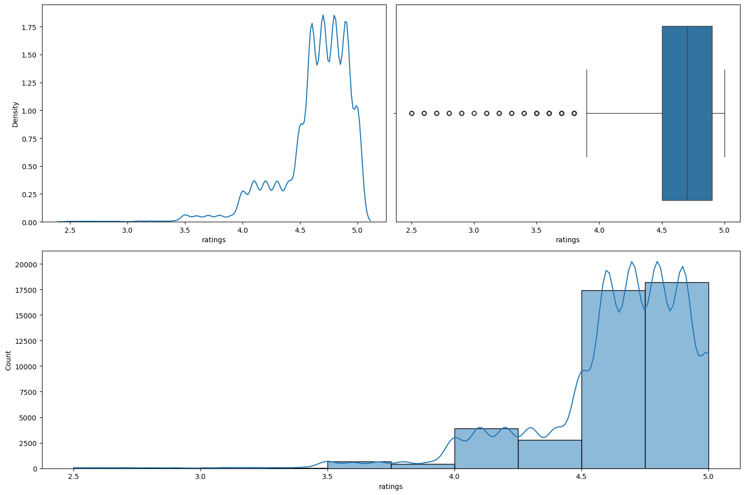
Running numerical_analysis on the column time_taken (the target) gives us the plots shown in Figure 13.
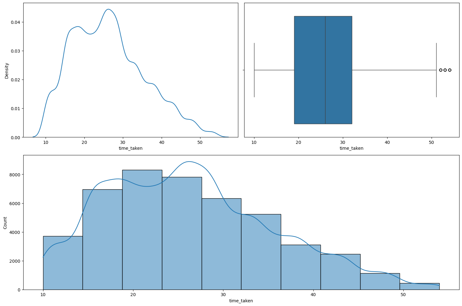
numerical_analysis on the target column.We can observe the following:
- The target column is not fully continuous in nature.
- It shows dual modality with two peaks: one around the 17-18 mark, and the other around the 26-27 mark.
- It has very few extreme points. They cannot be thought of outliers as they are just extreme and rare. A delivery time of 50 mins. is possible in certain rare circumstances.
Figure 14 shows the Q-Q plot of the target variable.
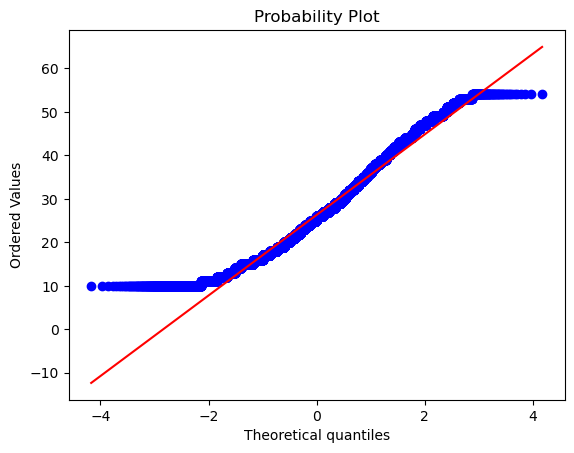
The tails differ significantly from the normal distribution. Even running the normality_test function gave the output that this column, i.e., the target, is not normally distributed. We also found that all the observations for which the target column is high, the traffic condition is either high or jam, which is expected. However, we found that weather didn’t affect this column much as the distribution of weather types were mostly uniformly distributed even for higher values of time_taken, i.e., the target. Further, we also found that deliveries that lake longer time also have larger distance associated with them, which is again expected.
Transforming time_taken using Yeo-Johnson Transformation
We tried using the Yeo-Johnson transformation on the column time_taken with the intention to make it more normal looking. Figure 15 shows the plot given by the numerical_analysis function on this column after the transformation.
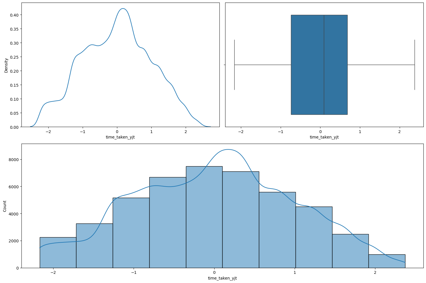
numerical_analysis on the target column after taking the Yeo-Johnson transformation.As we can see, the transformation did make it look more normal, however the normality_test function still categorized it as being not normal. But it is closer to a normal distribution than before taking the transformation. So, we will do this transformation on the target.
rider_id
Our main reasoning behind keeping this column was to check whether it can be used to fill in the missing values in the columns age and ratings. However, after grouping the data by rider_id and then checking the age and the ratings column, we observed that there are many inconsistencies in this column. For instance, many rows have the same rider_id but different values of age and ratings. Hence, this column cannot be used to fill in the missing values in age and ratings. We will drop this column.
age
Figure 16 shows the plots generated after running the numerical_analysis function on the column age.
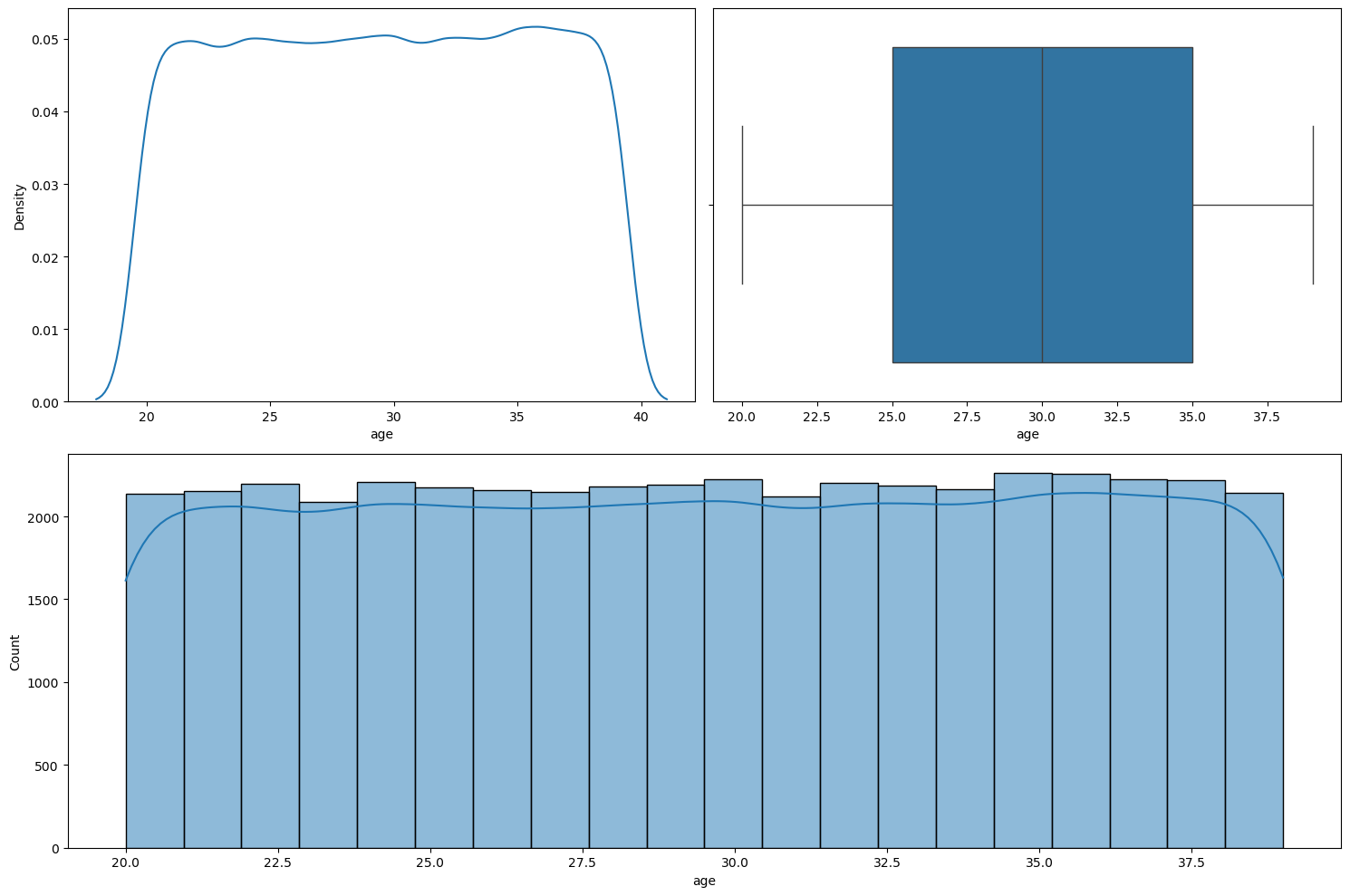
numerical_analysis on the column age.We can see that age seems to be nearly uniformly distributed between 20 to 39.
Relationship between time_taken (target) and age
Figure 17 shows a scatter plot between time_taken and age.
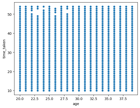
time_taken and age.We can see that age does not seem to affect the target time_taken. So the delivery time is not dependent on age of the delivery person. We can also see that age is a discrete numerical column.
Relationship between time_taken, age, and type_of_vehicle
Figure 18 shows a scatter plot between time_taken and age with hue as vehicle_condition.
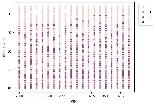
time_taken and age with hue as vehicle_condition.We can see that for higher values of time_taken, i.e., for longer deliveries, generally the vehicles with the best condition (0) are used.
Relationship between age and type_of_vehicle
Figure 19 shows a strip plot between age and type_of_vehicle.
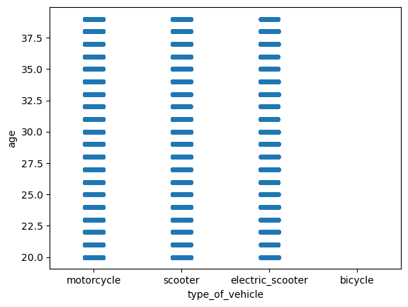
age and type_of_vehicle.We can see that there is no preference of type_of_vehicle with age. The reason we do not seem to have any ages for bicycles may be because there are missing values in the age column whenever the type_of_vehicle is bicycle.
ratings
Figure 20 shows the plots generated after running the numerical_analysis function on the column ratings.
numerical_analysis on the column ratings.We can see that this column is left-skewed with most of the ratings as greater than 4.
Relationship between time_taken (target) and ratings
Figure 21 shows a scatter plot between time_taken and ratings.
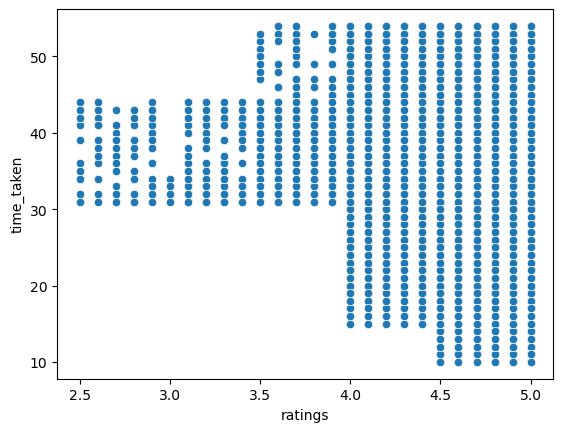
time_taken and ratings.We can see that the riders with high ratings are preferred for longer deliveries. Further, riders with high ratings also get more orders. So, higher ratings will give riders more work, and hence more income.
Relationship between vehicle_condition and ratings
Figure 22 shows the plots generated after running the categorical_numerical_analysis function with the categorical column as vehicle_condition and the numerical column as ratings.
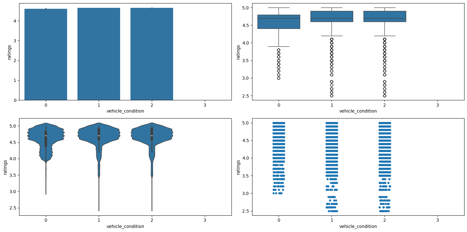
categorical_numerical_analysis with the categorical column as vehicle_condition and the numerical column as ratings.We observe the following:
- We can see that the average
ratingseems to be very similar for the first three vehicle conditions. - However, riders with the best
vehicle_condition(0) haveratingsof more than 3, whereas riders with the subsequentvehicle_conditionalso haveratingslower than 3. - The worst
vehicle_condition(3) has no data forratings. This may be because customers may not want to rate riders with such vehicles.
Relationship between type_of_vehicle and ratings
Figure 23 shows the plots generated after running the categorical_numerical_analysis function with the categorical column as type_of_vehicle and the numerical column as ratings.
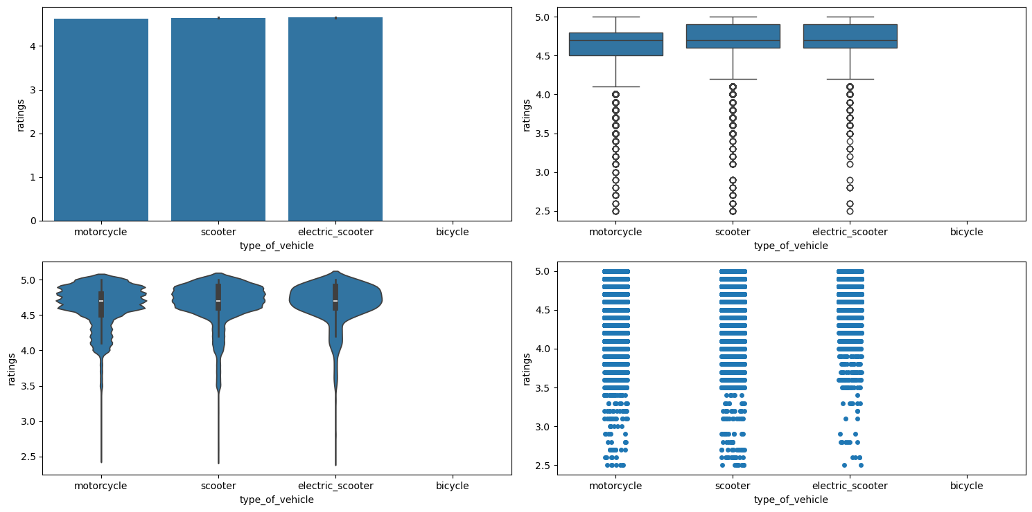
categorical_numerical_analysis with the categorical column as type_of_vehicle and the numerical column as ratings.We observe that:
- The mean ratings for all the
type_of_vehicle(except bicycle) seem very similar, however the strip plot indicates that electric scooters mostly have higherratingsas compared to the othertype_of_vehicle. - Bicycles do not have
ratingsbecause there areNaNvalues in ratings iftype_of_vehicleis bicycle.
Relationship between festivals and ratings
Figure 24 shows the plots generated after running the categorical_numerical_analysis function with the categorical column as festival and the numerical column as ratings.
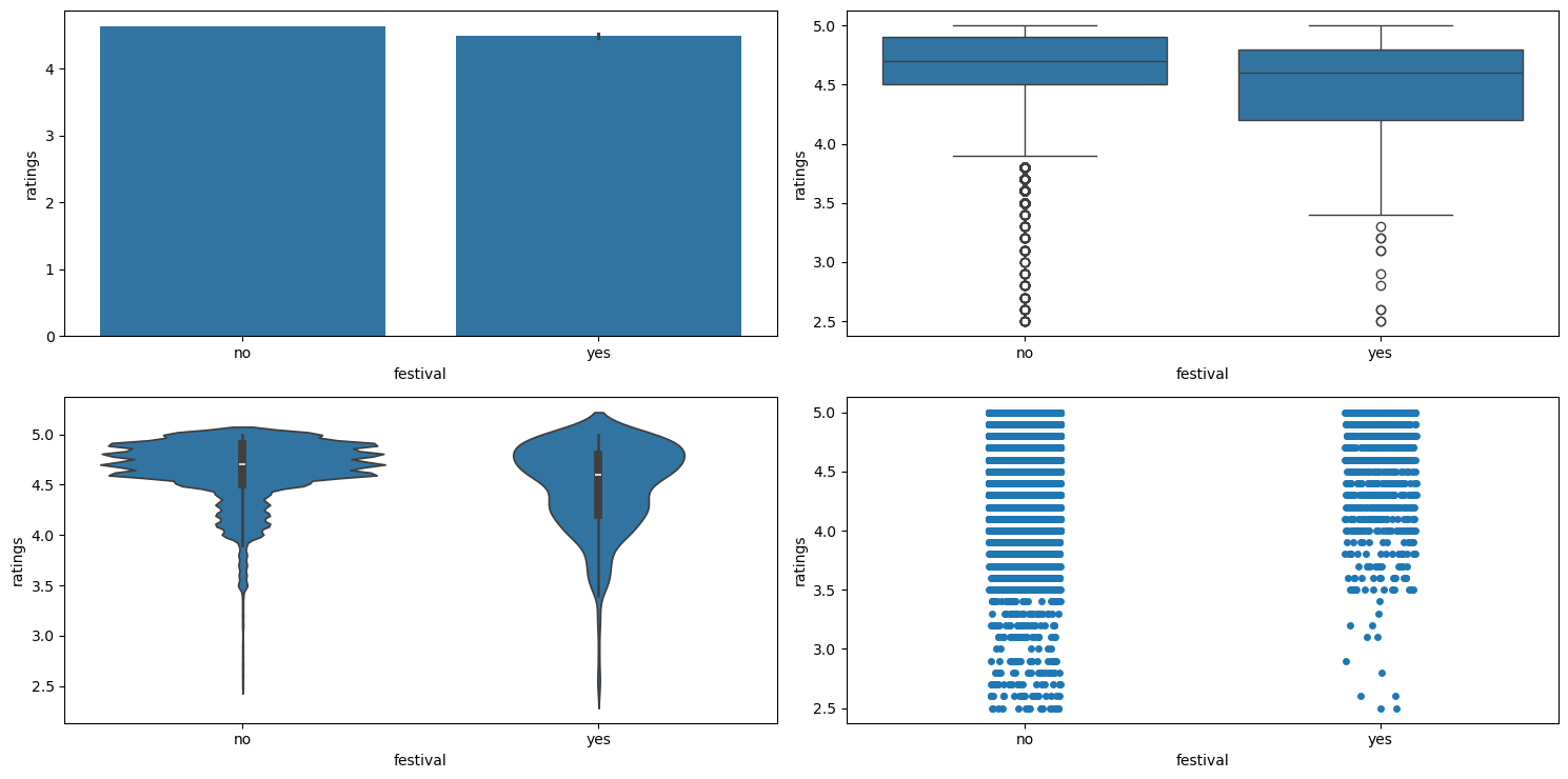
categorical_numerical_analysis with the categorical column as festival and the numerical column as ratings.We can see that during festivals, the ratings generally go down.
Location Columns
We use the location columns for delivery, i.e., delivery_latitude and delivery_longitude, to plot the locations on an interactive map to visualize where the deliveries are being done. We use plotly.express to do this. Figure 25 shows this plot.

delivery_latitude and delivery_longitude plotted on an interactive map. order_date and Related Columns
The related columns are order_date, order_day, order_month, order_day_of_week, order_day_is_weekend, and festival
Relationship between time_taken (target) and order_day_of_week
Figure 26 shows the plots generated after running the categorical_numerical_analysis function with the categorical column as order_day_of_week and the numerical column as time_taken.
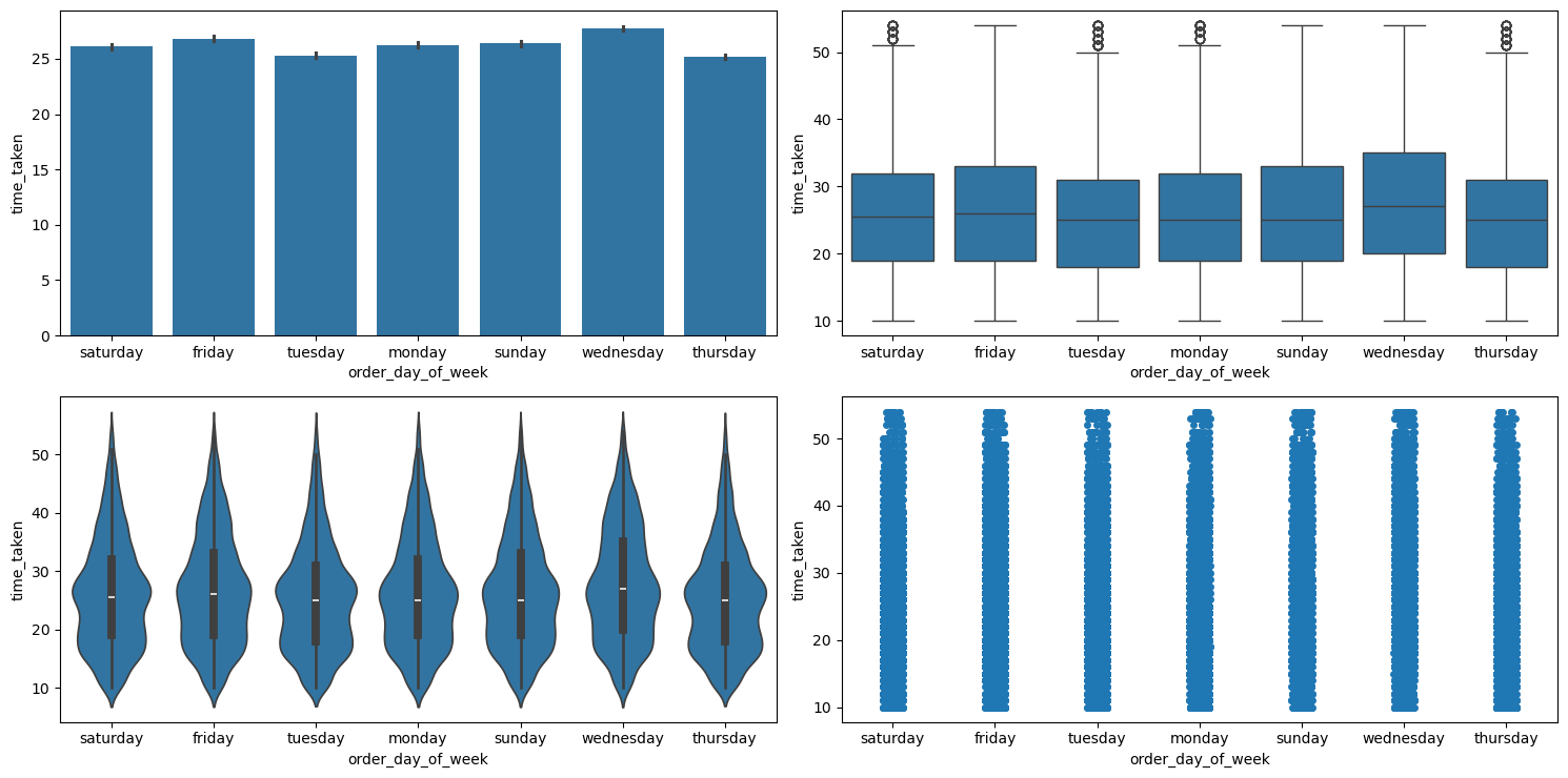
categorical_numerical_analysis with the categorical column as order_day_of_week and the numerical column as time_taken.We can see that on an average, delivery times are slightly lesser on Thursdays.
Relationship between time_taken (target) and order_day_is_weekend
Figure 27 shows the plots generated after running the categorical_numerical_analysis function with the categorical column as order_day_is_weekend and the numerical column as time_taken.
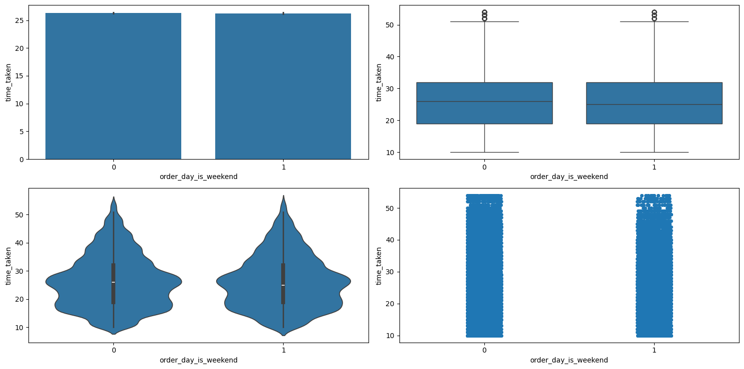
categorical_numerical_analysis with the categorical column as order_day_is_weekend and the numerical column as time_taken.The distribution looks very similar. So it doesn’t look like order_day_is_weekend affects the target time_taken.
Relationship between traffic and order_day_is_weekend
After running the chi2_test function on these two columns, we found that there is not enough evidence in the data to suggest that there is any significant association between them.
Relationship between time_taken (target) and festival
Figure 28 shows the plots generated after running the categorical_numerical_analysis function with the categorical column as festival and the numerical column as time_taken.
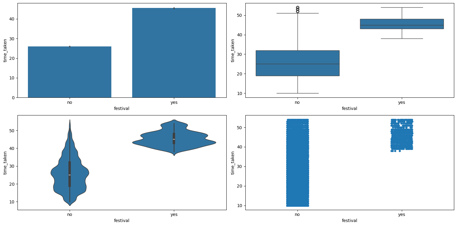
categorical_numerical_analysis with the categorical column as festival and the numerical column as time_taken.We observe the following:
- Clearly, if there is a
festival, then the delivery time is longer on average. - Also, the range of delivery times is shorter with lesser variation when there is a festival.
Relationship between festival and traffic
After running the chi2_test function on these two columns, we found that there is enough evidence in the data to suggest that there is a significant association between them. To view this difference, we created a pivot table which is shown in Table 4.
| Traffic Density | Festival: No | Festival: Yes |
|---|---|---|
high | 27.010373 | 45.826087 |
jam | 30.538039 | 46.093651 |
low | 21.284332 | 42.020000 |
medium | 26.550288 | 43.715385 |
Table 4: Average delivery time (in minutes) across traffic conditions and festival days.
We can clearly see how time_taken increases with increase in traffic congestion. Also, it seems like during festivals the delivery always takes longer.
Relationship between festival, order_day_is_weekend, and time_taken
Figure 29 shows the plots generated after running the multivariate_analysis function with the numerical column as time_taken, and the two categorical columns as order_day_is_weekend and festival.
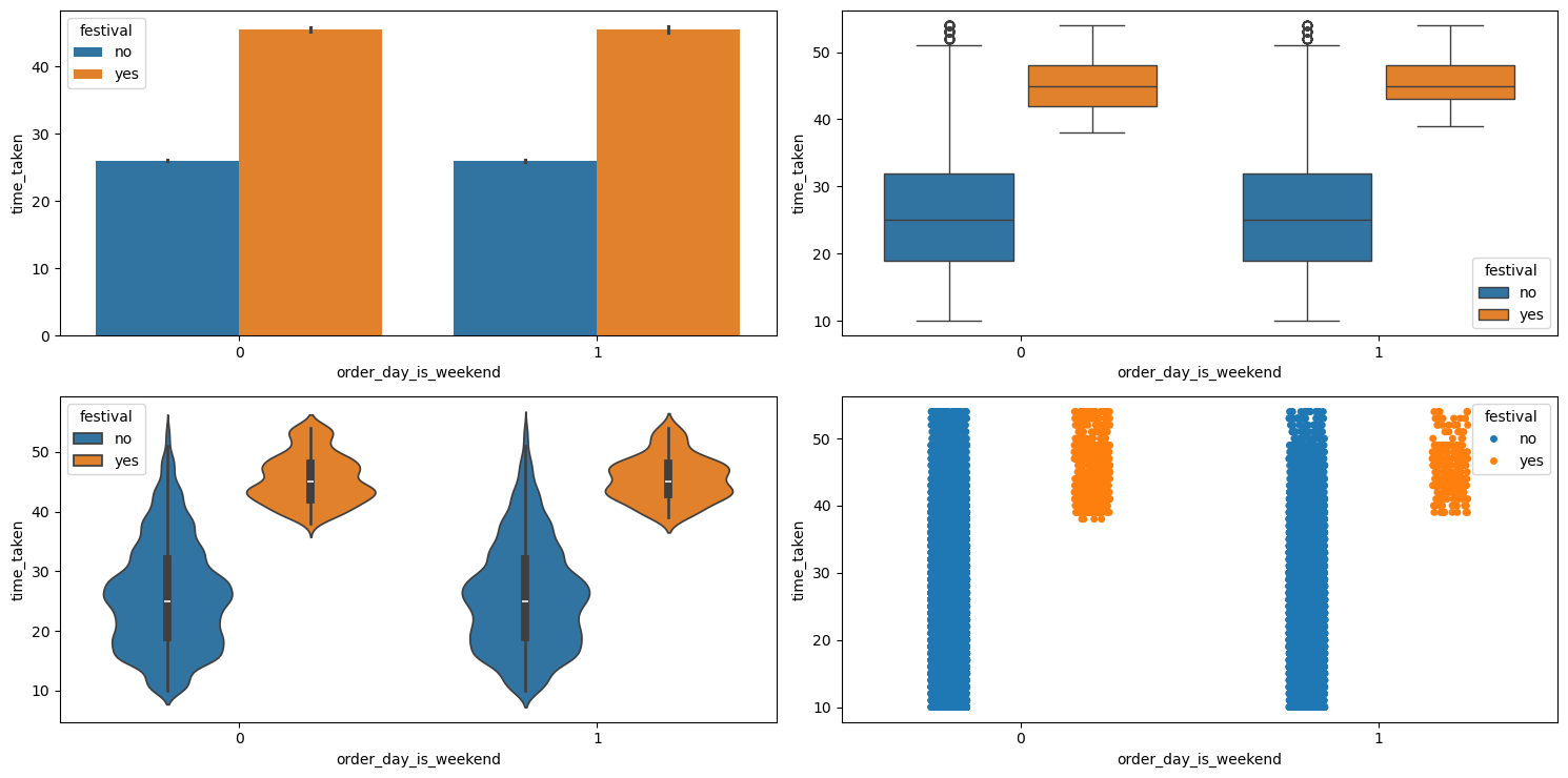
multivariate_analysis with numerical column as time_taken and the two categorical columns as order_day_is_weekend and festival.We can see that it doesn’t matter whether a festival falls on a weekend. The time_taken is similarly distributed in either case.
order_time and Related Columns
The columns related to order_time are order_time_hour, order_time_of_day, and pickup_time_minutes.
Relationship between order_time_of_day and time_taken (target)
Figure 30 shows the plots generated after running the categorical_numerical_analysis function with the categorical column as order_time_of_day and the numerical column as time_taken.
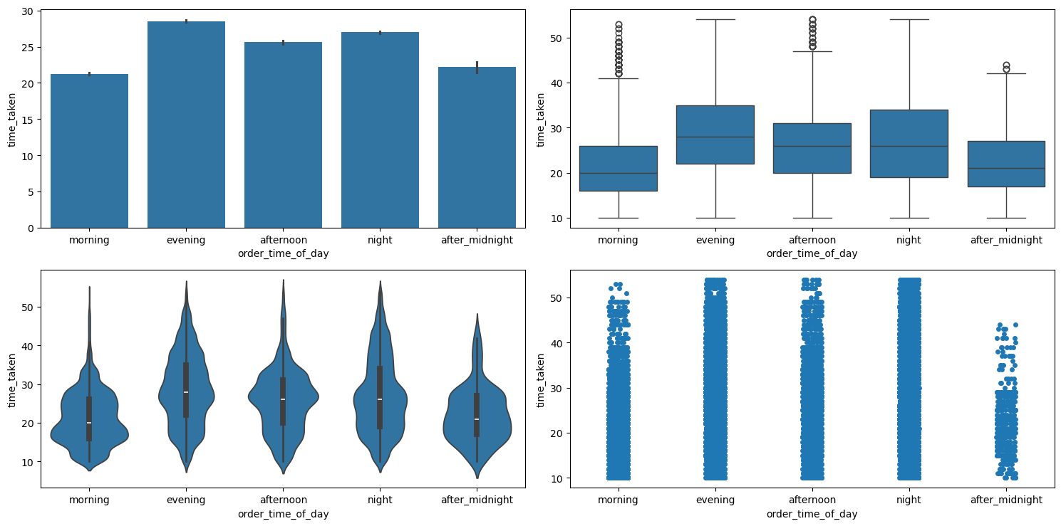
categorical_numerical_analysis with the categorical column as order_time_of_day and the numerical column as time_taken.We can see that deliveries in the morning are the quickest whereas the deliveries in the evening are the longest. Running the function anova_test on these two columns also confirmed that the data indicates significant relationship between them. After using the value_counts function on the order_time_of_day column, we found that most orders are placed at 9 p.m. Figure 31 shows a bar plot of this count.
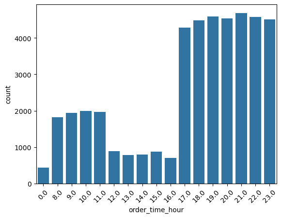
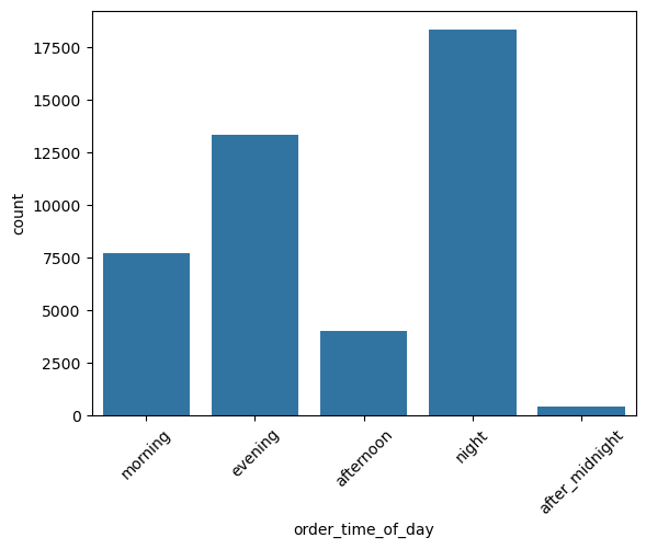
order_time_hour.Further, Figure 32 shows the same bar plot for the column order_time_of_day.
order_time_of_day.pickup_time_minutes
Relationship between time_taken (target) and pickup_time_minutes
Figure 33 shows a scatter plot between the target, i.e., time_taken, and pickup_time_minutes.
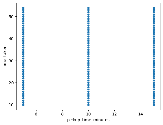
time_taken and pickup_time_minutes.We observe the following:
- So there is no relationship between
pickup_time_minutesandtime_taken. - We can also see that
pickup_time_minutescan be treated like an ordinal categorical column.
So, running the categorical_analysis funcdtion on this column gives us the bar plot of the count of values in this column, which is shown in Figure 34.
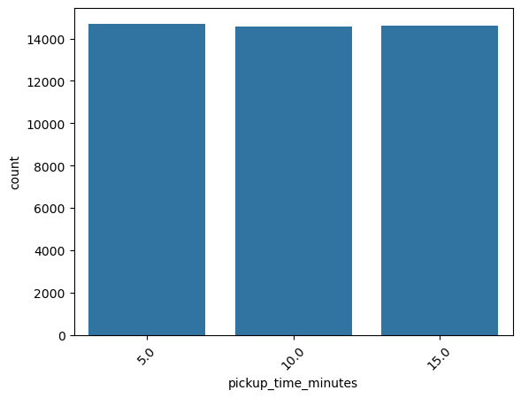
pickup_time_minutes.We can see that the three categories in pickup_time_minutes are almost equally distributed. Next, Figure 35 shows the plots generated after running the categorical_numerical_analysis function with categorical column as pickup_time_minutes and numerical column as time_taken.
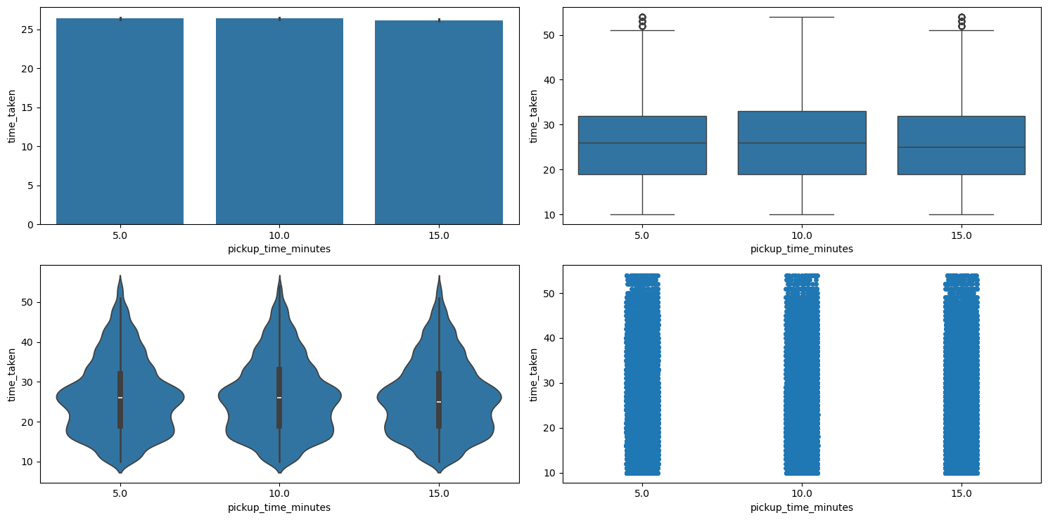
categorical_numerical_analysis with the categorical column as pickup_time_minutes and the numerical column as time_taken.Here also we can see that the different categories in pickup_time_minutes have no relation with the target time_taken. This was also confirmed by running the anova_test function on these two columns.
traffic
This is a categorical column. Running the function categorical_analysis on this column gives the bar plot of the count of its categories, which is shown in Figure 36.
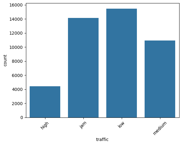
traffic.Most of the times the traffic is either low or is jam.
Relationship between traffic and city_type, and traffic and city_name
Running the chi2_test function on traffic and city_type indicated a significant association between them. However, the same test on traffic and city_name indicated no significant association.
Relationship between time_taken (target) and traffic
Figure 37 shows the plots generated after running the categorical_numerical_analysis function with categorical column as traffic and numerical column as time_taken.
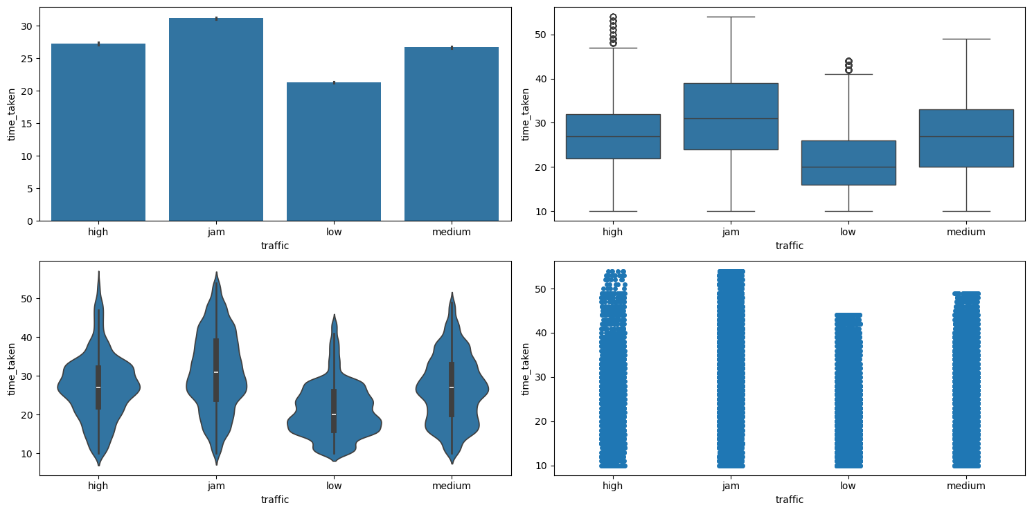
categorical_numerical_analysis with the categorical column as traffic and the numerical column as time_taken.Clearly, time_taken is lower when traffic has the least congestion, and vice versa. The association between these two variables was also confirmed after running the anova_test function on them.
Relationship between time_taken (target), traffic, and type_of_vehicle
Figure 38 shows the plots generated after running the multivariate_analysis function with the numerical column as time_taken, and the two categorical columns as traffic and type_of_vehicle.
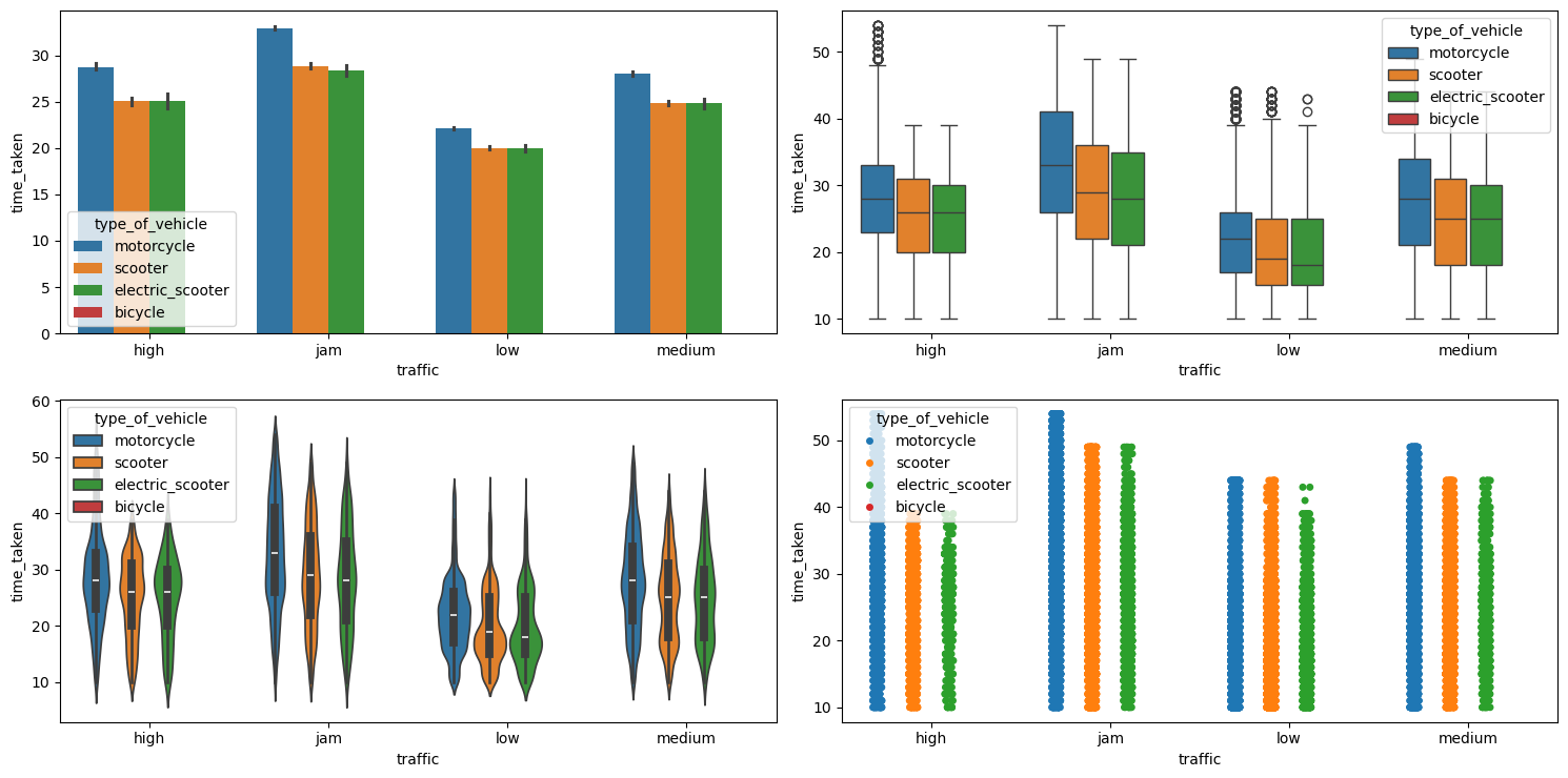
multivariate_analysis with numerical column as time_taken and the two categorical columns as traffic and type_of_vehicle.We can see that motorcycles take longer time as compared to scooters and electric scooters. Bicycle has no points due to it having missing values in the corresponding traffic column, maybe due to the fact that bicycle people do not use smart phones.
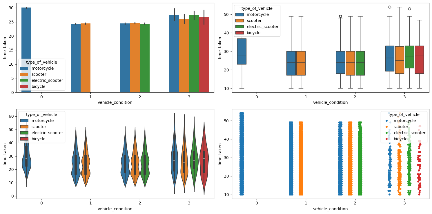
Relationship between time_taken (target), traffic, and vehicle_condition
Figure 39 shows the plots generated after running the multivariate_analysis function with the numerical column as time_taken, and the two categorical columns as traffic and vehicle_condition.
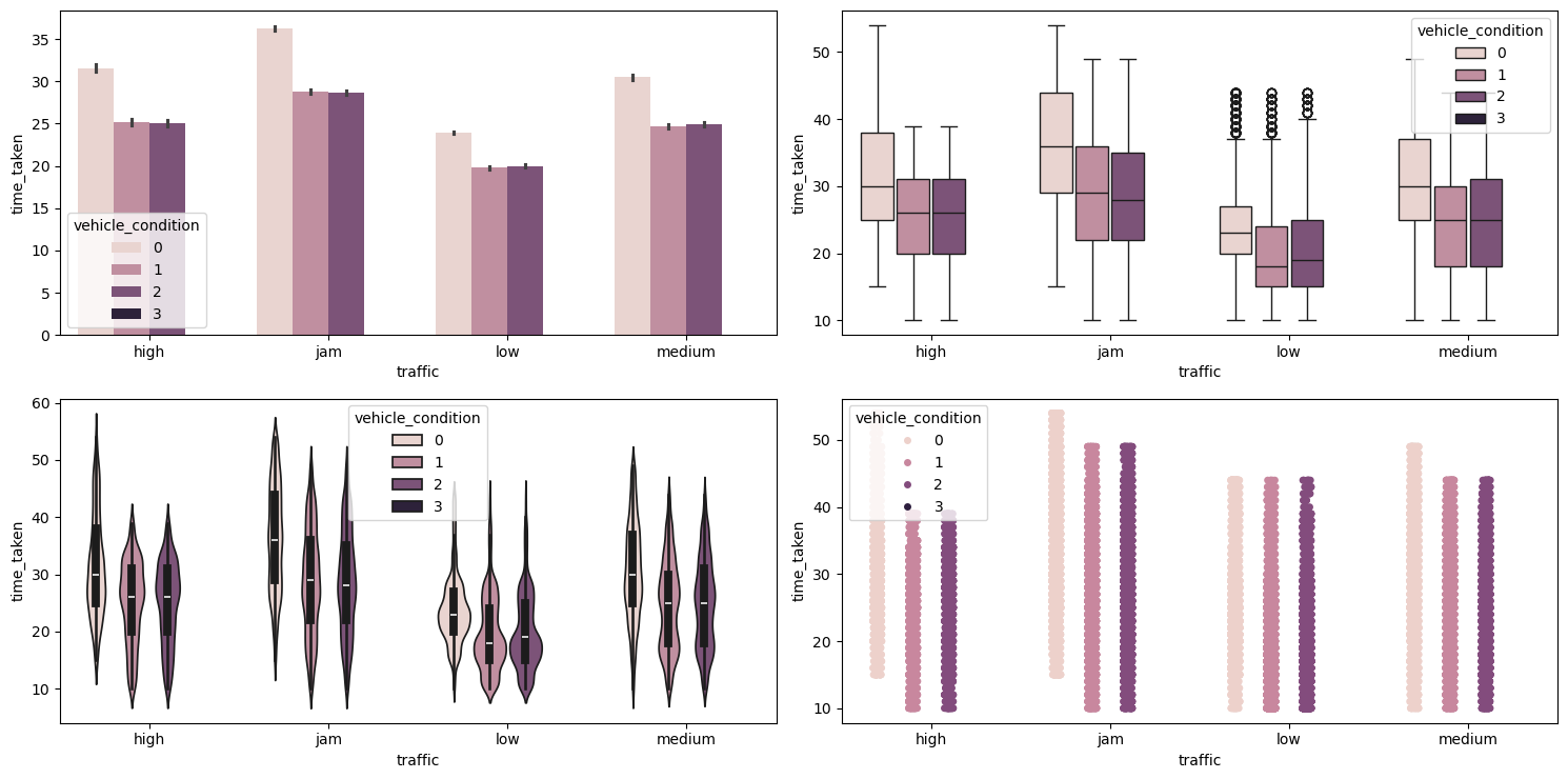
multivariate_analysis with numerical column as time_taken and the two categorical columns as traffic and vehicle_condition.We can see that vehicles with the best condition have longer time_taken. This may be because the vehicles with the best vehicle_condition are preferred for longer deliveries.
Relationship between time_taken, festival, and vehicle_condition
Figure 40 shows the plots generated after running the multivariate_analysis function with the numerical column as time_taken, and the two categorical columns as festival and vehicle_condition.
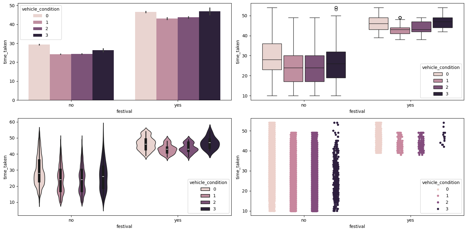
multivariate_analysis with numerical column as time_taken and the two categorical columns as festival and vehicle_condition.We can see that during festivals the vehicles with the worst vehicle_condition take longer, maybe due to breakdowns. They are also getting less orders during festivals, as evident from the strip plot (bottom right).
multiple_deliveries
This is like a categorical column.
Relationship between multiple_deliveries and time_taken (target)
Figure 41 shows the plots generated after running the categorical_numerical_analysis function with the categorical column as multiple_deliveries and the numerical column as time_taken.
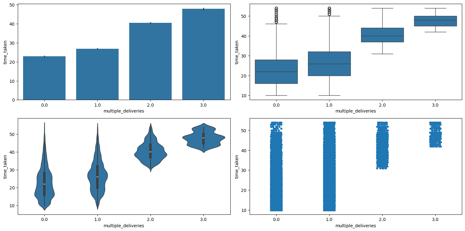
categorical_numerical_analysis with the categorical column as multiple_deliveries and the numerical column as time_taken.Clearly, more deliveries take longer time. This is also confirmed by running the anova_test function on time_taken and multiple_deliveries.
Relationship between multiple_deliveries and distance
Figure 42 shows the plots generated after running the categorical_numerical_analysis function with the categorical column as multiple_deliveries and the numerical column as distance.
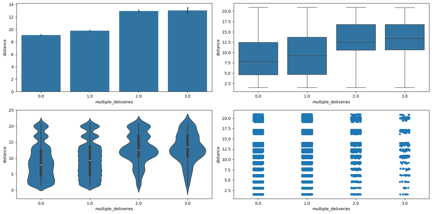
categorical_numerical_analysis with the categorical column as multiple_deliveries and the numerical column as distance.We can see that with more multiple_deliveries, the distance also increases.
weather
This is a categorical column. Running the categorical_analysis function on this gives a bar plot of the count of categories that are shown in Figure 43.
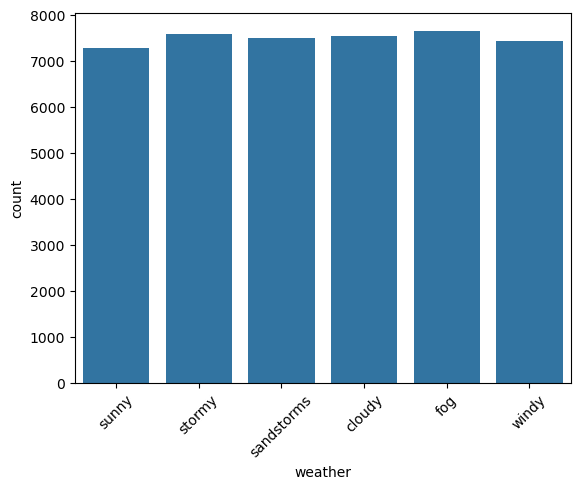
weather.We can see that the categories in weather are uniformly distributed. There is no imbalance.
Relationship between time_taken (target) and weather
Figure 44 shows the plots generated after running the categorical_numerical_analysis function with the categorical column as weather and the numerical column as time_taken.
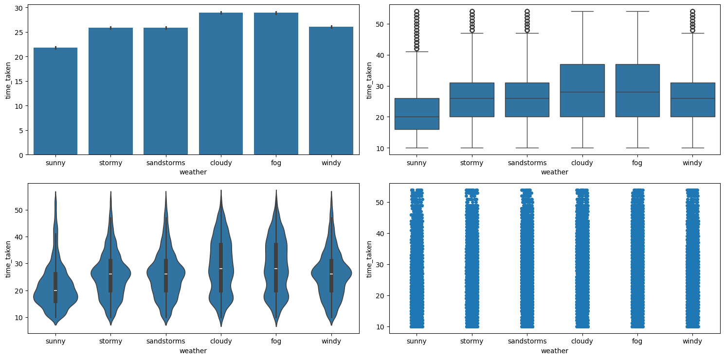
categorical_numerical_analysis with the categorical column as weather and the numerical column as time_taken.We can see that time_taken is higher for bad weather. The fact that they are associated was also confirmed after running the anova_test function on them.
Relationship between weather and traffic
Running the chi2_test function on them revealed no significant association between the two.
Relationship between weather, traffic, and time_taken
Figure 45 shows the plots generated after running the multivariate_analysis function with the numerical column as time_taken, and the two categorical columns as weather and traffic.
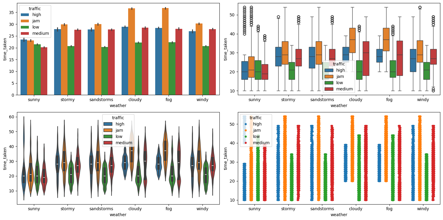
multivariate_analysis with numerical column as time_taken and the two categorical columns as weather and traffic.We can see that traffic has a similar distribution with respect to time_taken in all weather conditions. So, traffic is a more important feature as compared to weather for predicting time_taken (target). Table 5 shows a pivot table of average value of these three columns.
| Weather Condition | High Traffic | Jam Traffic | Low Traffic | Medium Traffic |
|---|---|---|---|---|
cloudy | 28.940860 | 36.689655 | 22.208445 | 28.483134 |
fog | 28.426546 | 36.806916 | 22.303427 | 28.044816 |
sandstorms | 27.711840 | 30.018758 | 20.297049 | 27.738522 |
stormy | 27.845839 | 29.850194 | 20.681734 | 27.680502 |
sunny | 23.448980 | 23.082132 | 21.449293 | 20.195518 |
windy | 26.972789 | 30.219056 | 20.665862 | 27.888769 |
Table 5: Average delivery time (in minutes) across traffic conditions and weather types.
vehicle_condition
This is a categorical column. Running the categorical_analysis function on it gives the bar plot of count of the categories in this column which is shown in Figure 46.
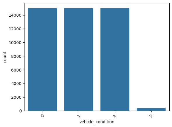
vehicle_condition.We can see that the worst vehicle_condition (3) is rare. We will need to handle it.
Relationship between time_taken (target) and vehicle_condition
Figure 47 shows the plots generated after running the categorical_numerical_analysis function with the categorical column as vehicle_condition and the numerical column as time_taken.
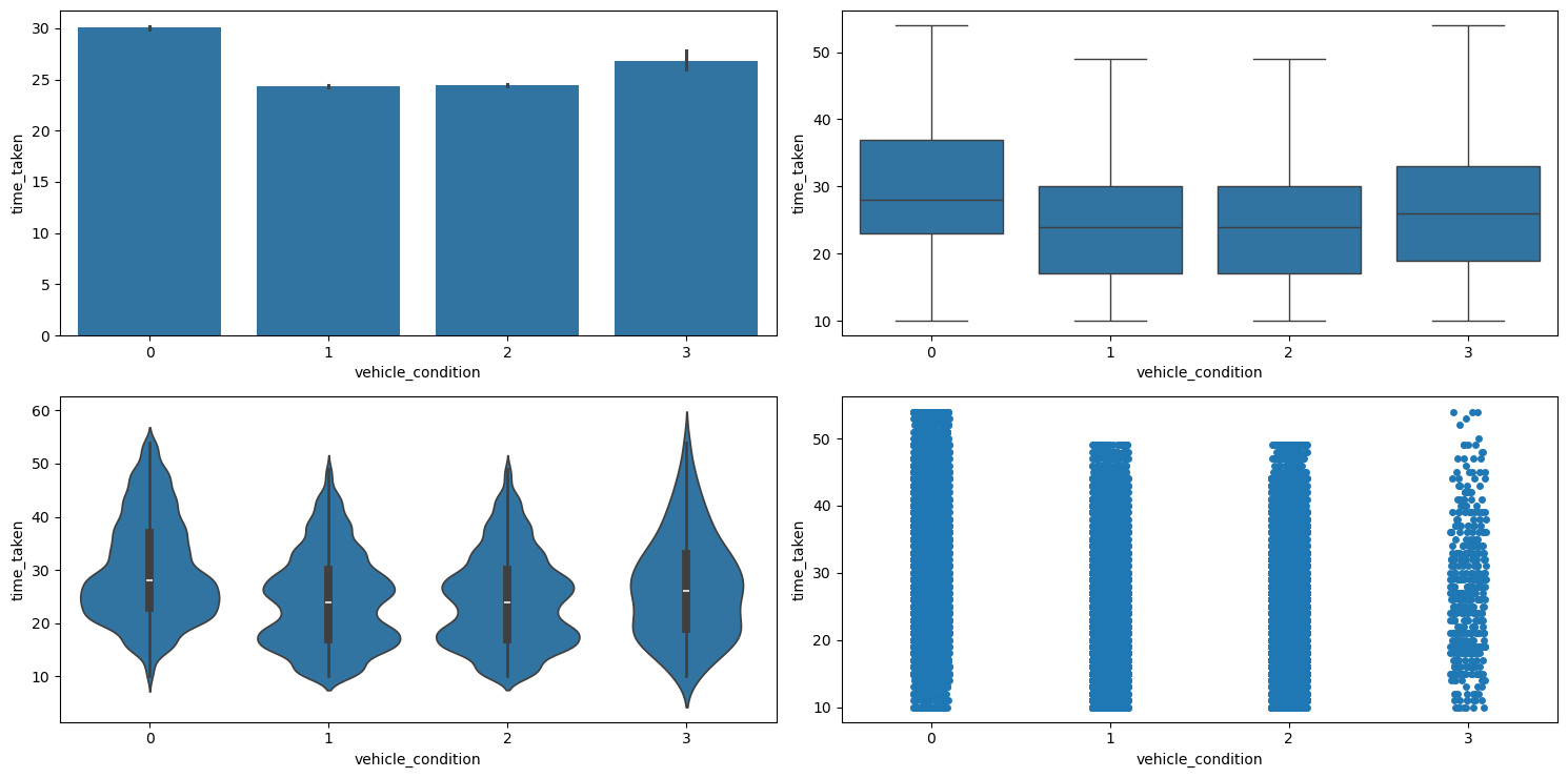
categorical_numerical_analysis with the categorical column as vehicle_condition and the numerical column as time_taken.We can see that the vehicles with the best vehicle_condition take longer. This is because such vehicles are preferred for longer deliveries. Their association was also confirmed by running the anova_test function on the two.
type_of_vehicle
This is a categorical column. Running the categorical_analysis function on it gives the bar plot of count of the categories in this column which is shown in Figure 48.
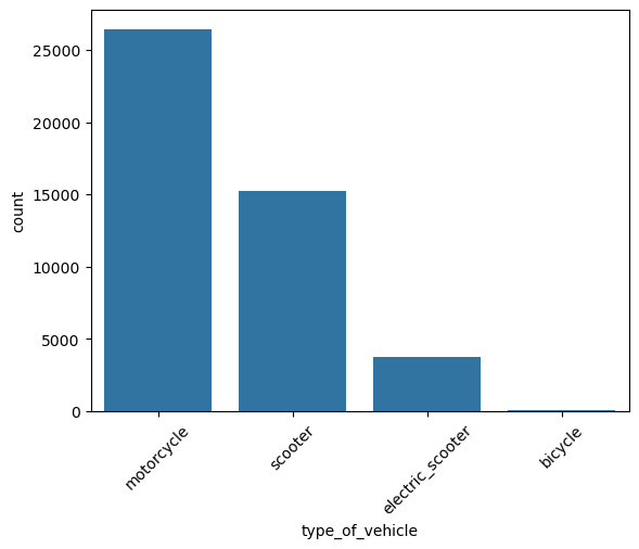
type_of_vehicle.We can see that bicycles are extremely rare. We will have to handle it.
Relationship between time_taken (target) and type_of_vehicle
Figure 49 shows the plots generated after running the categorical_numerical_analysis function with the categorical column as type_of_vehicle and the numerical column as time_taken.
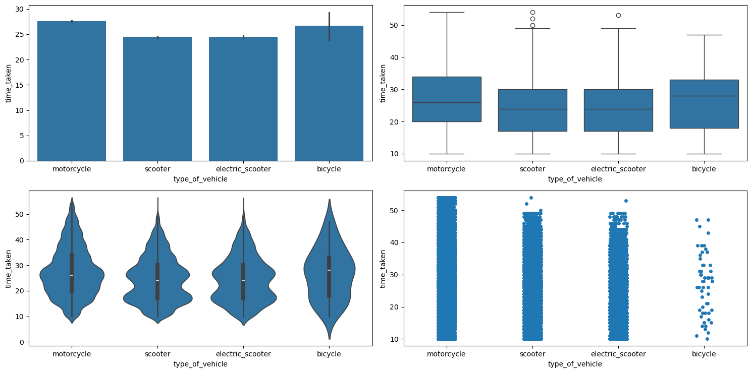
categorical_numerical_analysis with the categorical column as type_of_vehicle and the numerical column as time_taken.We can see that motorcycles are preferred for longer deliveries.
Relationship between vehicle_condition, type_of_vehicle, and time_taken (target)
Figure 50 shows the plots generated after running the multivariate_analysis function with the numerical column as time_taken, and the two categorical columns as vehicle_condition and type_of_vehicle.
multivariate_analysis with numerical column as time_taken and the two categorical columns as vehicle_condition and type_of_vehicle.We can observe the following:
- The best
vehicle_conditiononly has motorcycles. The next bestvehicle_conditionhas motorcycles and scooters; the next best has motorcycles, scooters, and electric scooters; and the worstvehicle_conditionhas all, i.e., motorcycles, scooters, electric scooters, and bicycles. - The delivery times for motorcycles is the highest mostly because they are getting long distance deliveries.
Relationship between type_of_vehicle and vehicle_condition
Running the chi2_test function on these two columns indicated a significant association between them.
type_of_order
This is a categorical column. Running the categorical_analysis function on it gives the bar plot of count of the categories in this column which is shown in Figure 51.
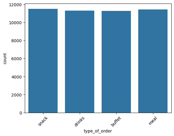
type_of_order.All the type_of_orders are mostly uniformly distributed.
Relationship between time_taken (target) and type_of_order
Figure 52 shows the plots generated after running the categorical_numerical_analysis function with the categorical column as type_of_order and the numerical column as time_taken.
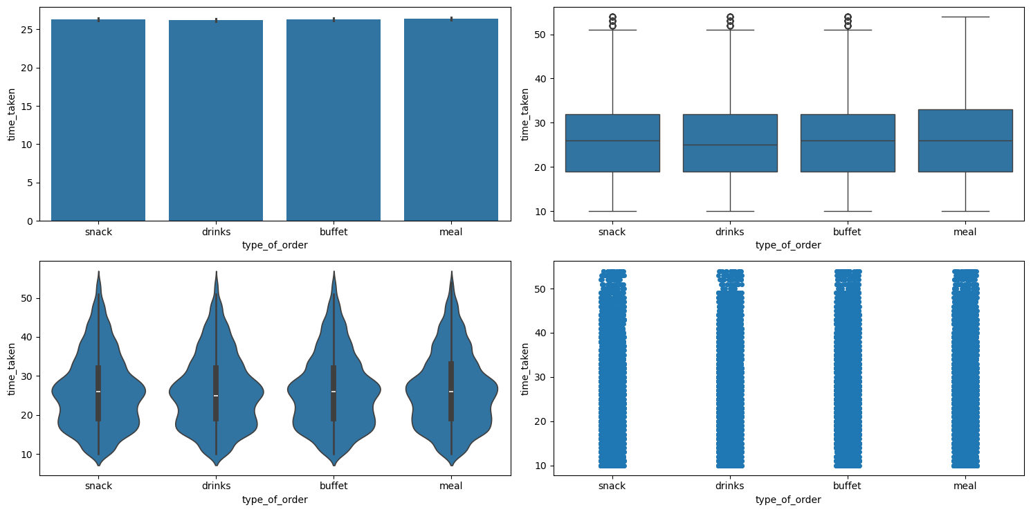
categorical_numerical_analysis with the categorical column as type_of_order and the numerical column as time_taken.It looks like type_of_order does not affect time_taken. This was also confirmed after running the anova_test function on these two columns.
Relationship between type_of_order and order_day_is_weekend
Table 6 shows the pivot table between these two columns.
| Type of Order | Weekday (0) | Weekend (1) |
|---|---|---|
buffet | 8238 | 3023 |
drinks | 8130 | 3164 |
meal | 8290 | 3145 |
snack | 8337 | 3175 |
Table 6: Distribution of order types across weekdays and weekends.
The proportions are more or less the same. So type_of_order doesn’t seem to depend on order_day_is_weekend.
Relationship between type_of_order and pickup_time_minutes
Running the chi2_test function on these indicated no significant association.
Relationship between type_of_order and ratings
Figure 53 shows the plots generated after running the categorical_numerical_analysis function with the categorical column as type_of_order and the numerical column as ratings.
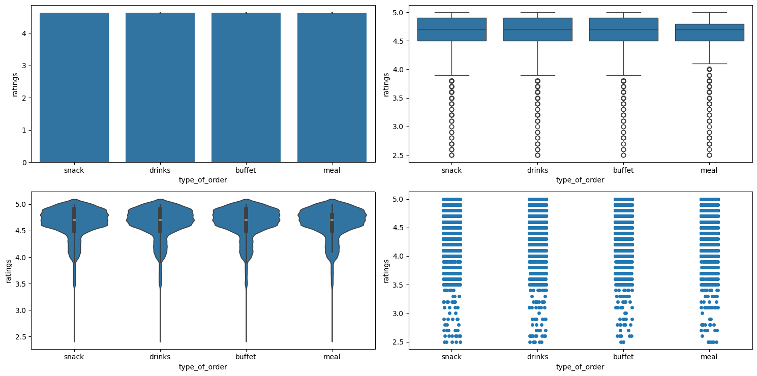
categorical_numerical_analysis with the categorical column as type_of_order and the numerical column as ratings.It looks like type_of_order has no effect on ratings.
Relationship between type_of_order and festival
Running the chi2_test function on these two indicated no significant association.
city_name
This is a categorical column. Running the function categorical_analysis on this column gives the bar plot of the count of its categories, which is shown in Figure 54.
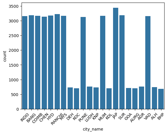
city_name.Relationship between time_taken (target) and city_name
Figure 55 shows the plots generated after running the categorical_numerical_analysis function with the categorical column as city_name and the numerical column as time_taken.
categorical_numerical_analysis with the categorical column as city_name and the numerical column as time_taken.It looks like there is no significant effect of city_name on time_taken.
city_type
This is a categorical column. Running the function categorical_analysis on this column gives the bar plot of the count of its categories, which is shown in Figure 56.
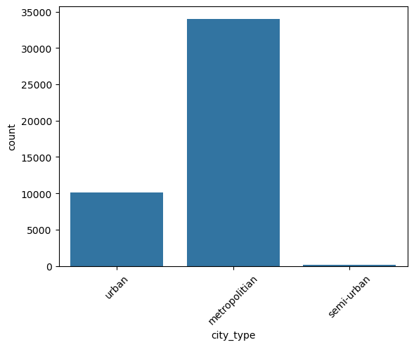
city_type.We can see that semi-urban city_type is extremely rare. We will need to handle it.
Relationship between time_take (target) and city_type
Figure 57 shows the plots generated after running the categorical_numerical_analysis function with the categorical column as city_type and the numerical column as time_taken.
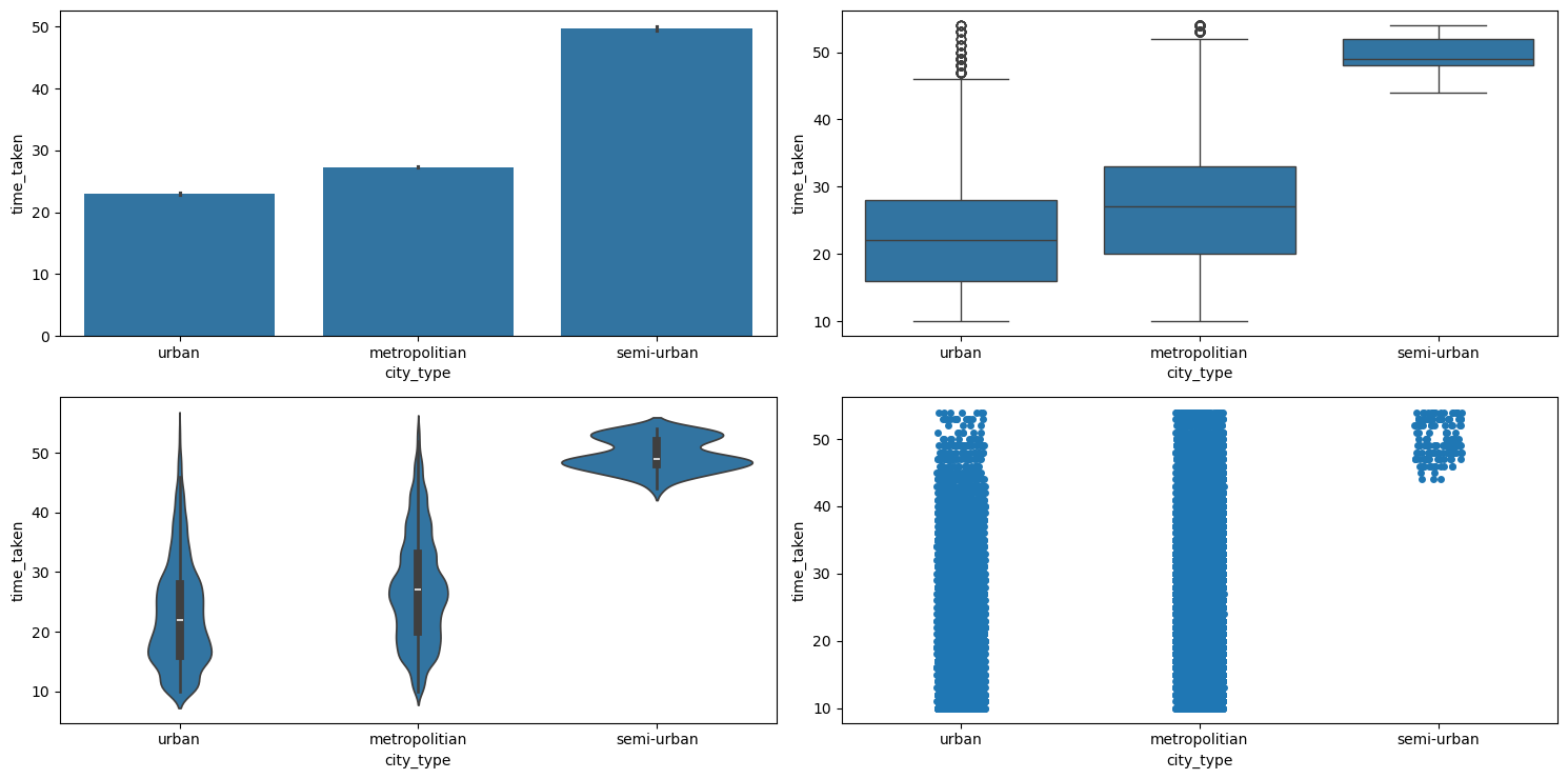
categorical_numerical_analysis with the categorical column as city_type and the numerical column as time_taken.Clearly, urban cities have the lowest time_taken, followed by metropolitian, and then semi-urban. The fact that they are associated was also confirmed by running the anova_test function on them.
Relationship between ratings and city_type
Figure 58 shows the plots generated after running the categorical_numerical_analysis function with the categorical column as city_type and the numerical column as ratings.
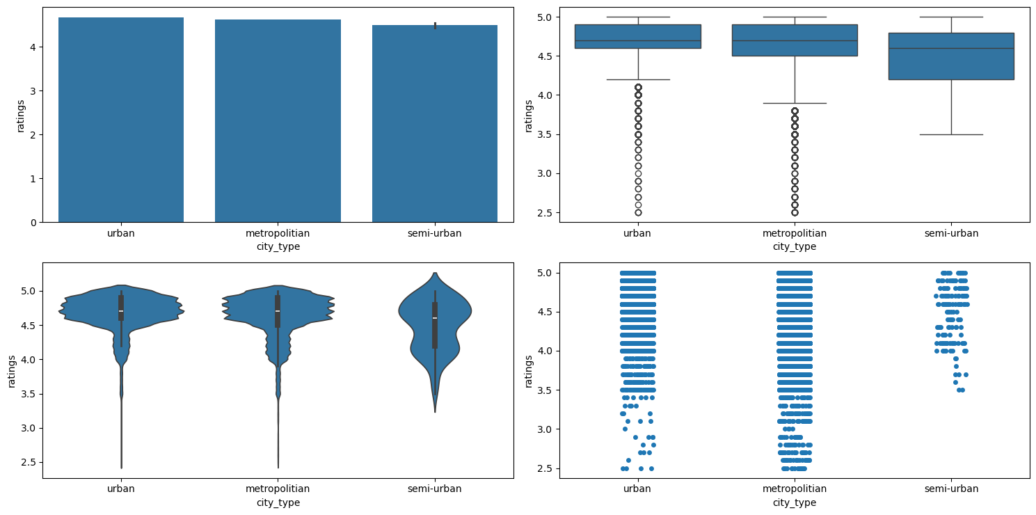
categorical_numerical_analysis with the categorical column as city_type and the numerical column as ratings.We can see that there are no ratings below 3.5 in cities of semi-urban city_type.
Relationship between time_taken (target), city_type, and type_of_vehicle
Figure 59 shows the plots generated after running the multivariate_analysis function with the numerical column as time_taken, and the two categorical columns as city_type and type_of_vehicle.
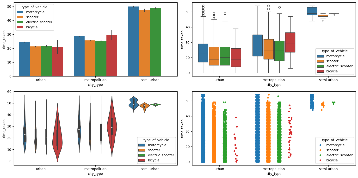
multivariate_analysis with numerical column as time_taken and the two categorical columns as city_type and type_of_vehicle.We can see that bicycles are not used in the cities with city_type as semi-urban.
distance
This is a numerical column. Running numerical_analysis on the column distance gives us the plots shown in Figure 60.
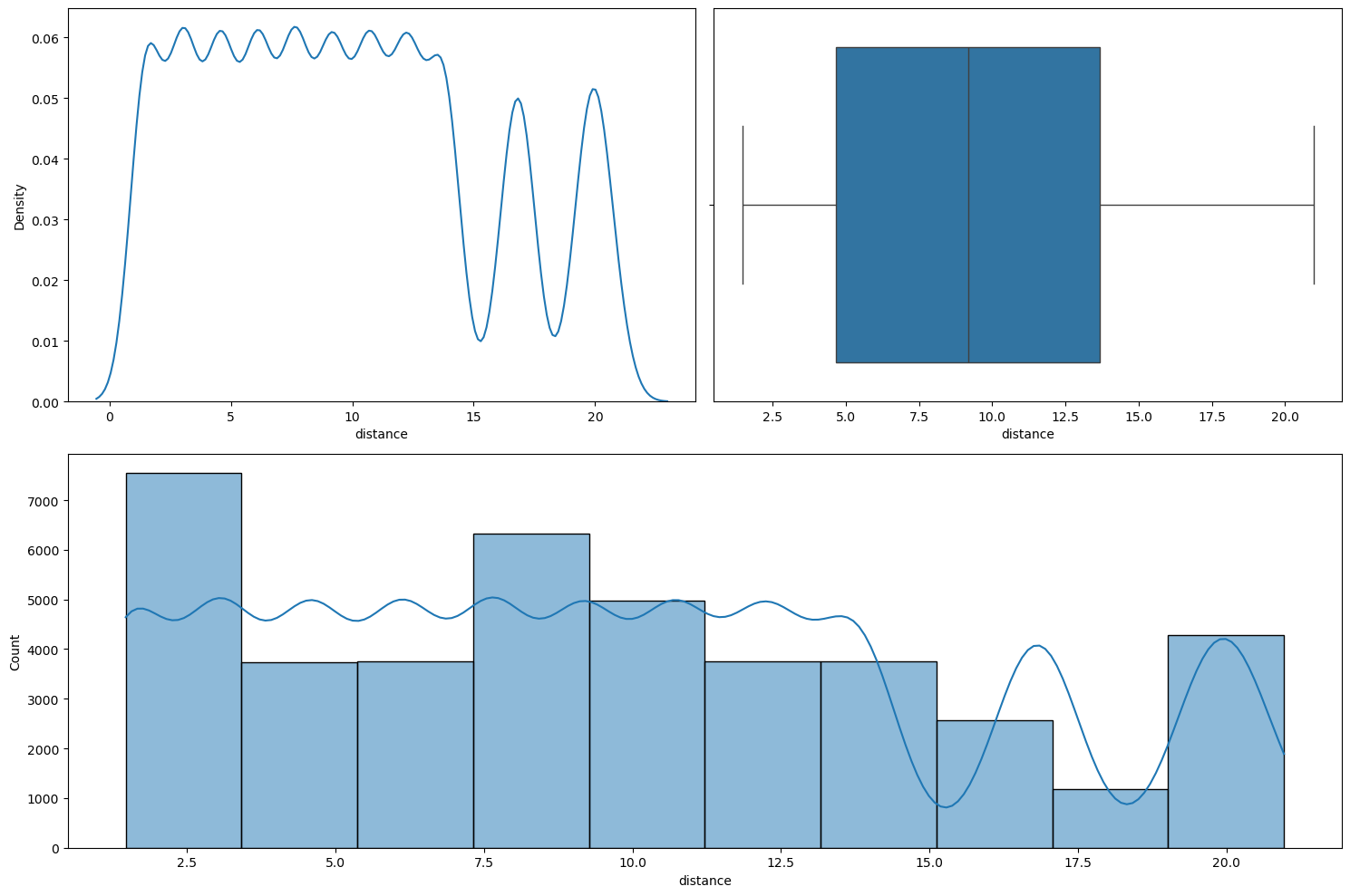
numerical_analysis on the column distance.We can see that the distribution is not normal.
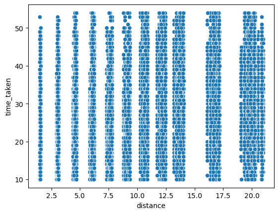
Relationship between time_taken (target) and distance
Figure 61 shows a scatter plot between time_taken and distance.
time_taken and distance.The values in the distance column also seem close to discrete. We also found that the correlation between time_taken and distance is about 0.32.
Relationship between type_of_vehicle and distance
Figure 62 shows the plots generated after running the categorical_numerical_analysis function with the categorical column as type_of_vehicle and the numerical column as distance.
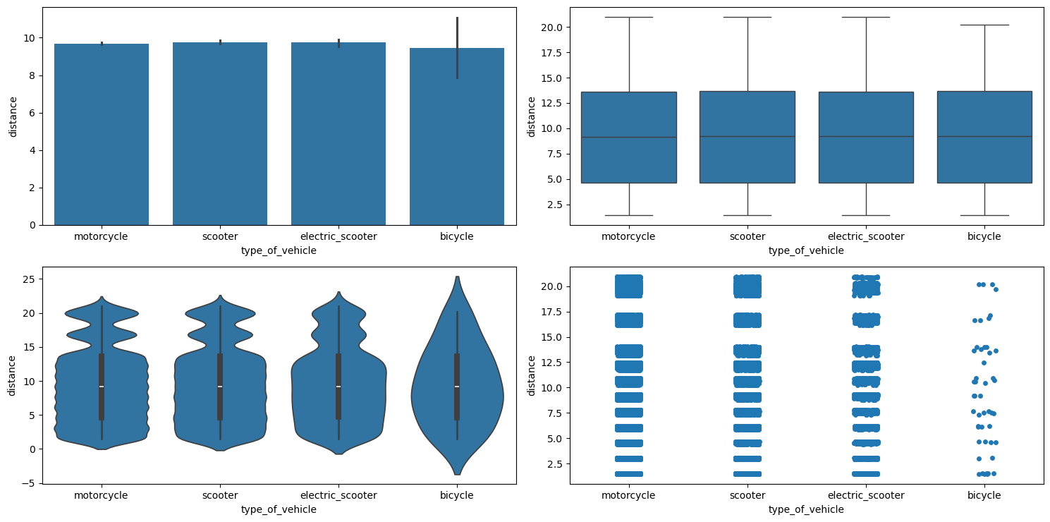
categorical_numerical_analysis with the categorical column as type_of_vehicle and the numerical column as distance.There doesn’t seem to be any relationship.
Relationship between distance and festival
Figure 63 shows the plots generated after running the categorical_numerical_analysis function with the categorical column as festival and the numerical column as distance.
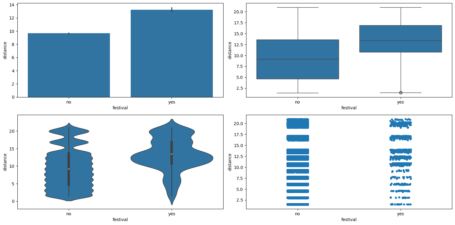
categorical_numerical_analysis with the categorical column as festival and the numerical column as distance.We can see that riders cover larger distances during festivals.
Jupyter Notebook
The entire EDA was carried out in this Jupyter notebook.
Building a Baseline Model
We will first create a baseline model by dropping all the missing values in the data. This will be a linear regression model. We will later compare it with the same linear regression model but with missing values imputed.
Baseline Model with Missing Values Dropped
Here, we first simply use the same function to clean the data. Further, we also drop the unnecessary columns that we identified during the EDA to not have much predictive power to predict the target. These column are:
rider_idrestaurant_latituderestaurant_longitudedelivery_latitudedelivery_longitudeorder_dateorder_time_hourorder_day
Next, we drop all the rows containing missing values, split the data into input features and the output, and finally split the data into training and test sets with 20% of the data in the test set.
Data Preprocessing
We have the following numerical columns:
-
age, -
ratings, -
pickup_time_minutes, -
distance,
the following nominal categorical columns:
-
weather, -
type_of_order, -
type_of_vehicle, -
festival, -
city_type, -
city_name, -
order_month, -
order_day_of_week, -
order_day_is_weekend, -
order_time_of_day,
and the following ordinal categorical columns:
-
traffic, -
distance_type.
Note that we also have the columns multiple_deliveries and vehicle_condition which are already encoded correctly. So we won’t perform any data preprocessing on them. Now, we use simple one-hot encoding for the nominal categorical column, and ordinal encoding for the ordered categorical column. For traffic, the ordinal encoding is done with the following order:
traffic_order = ['low', 'medium', 'high', 'jam']
and for distance_type it is done using the following order:
distance_type_order = ['short', 'medium', 'long', 'very_long']
Next, we build a preprocessor using scikit-learn’s ColumnTransformer. The code for that is the following:
preprocessor = ColumnTransformer(
    transformers=[
        ("scaler", MinMaxScaler(), num_cols),
        ("nominal_encoder", OneHotEncoder(drop="first", handle_unknown="ignore", sparse_output=False), nominal_cat_cols),
        ("ordinal_encoder", OrdinalEncoder(categories=[traffic_order, distance_type_order]), ordinal_cat_cols)
    ],
    remainder="passthrough",
    n_jobs=-1,
    force_int_remainder_cols=False,
    verbose_feature_names_out=False,
)
Notice that before encoding we are using the MinMaxScaler transformation on the columns. We train this preprocessor object on the training data and use it to transform the training as well as test sets.
Transforming the Target time_taken
As seen during the EDA, the Yeo-Johnson transformation makes the column time_taken (the target) become more normal. Hence, we train a PowerTransformer object with the Yeo-Johnson method on the training output and transform the training and the test outputs.
Model
Training a linear regression model on this data with missing values dropped gives us the error metrics shown in Table 7.
| Metric | Training Set | Test Set |
|---|---|---|
| MAE | 4.67 mins. | 4.73 mins. |
| R2 | 0.60 | 0.60 |
Table 7: Model performance metrics on training and test datasets with missing values dropped.
Baseline Model with Missing Values Imputed
We will follow the same data cleaning and preprocessing steps, however this time we will also impute the missing values. For imputing the missing values, we will need to check if simple imputation methods, like the mean or median imputation, will work by comparing the distribution of the column before and after imputation. If the distribution is more or less the same, we will stick with these simple techinques. Otherwise, we will use complex imputation techniques, like \(k\)-NN imputation.
The columns that have missing values are the following:
-
age, -
ratings, -
weather, -
traffic, -
multiple_deliveries, -
festival, -
city_type, -
distance, -
distance_type, -
pickup_time_minutes, -
order_time_of_day.
age
The distribution of age before and after median imputation is shown in Figure 64.
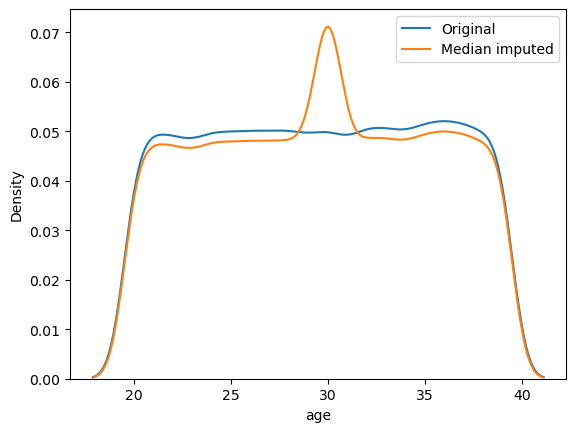
age before and after median imputation.The distribution of age has changed significantly. We should use advanced imputation techniques like \(k\)-NN imputation.
ratings
The distribution of ratings before and after median imputation is shown in Figure 65.
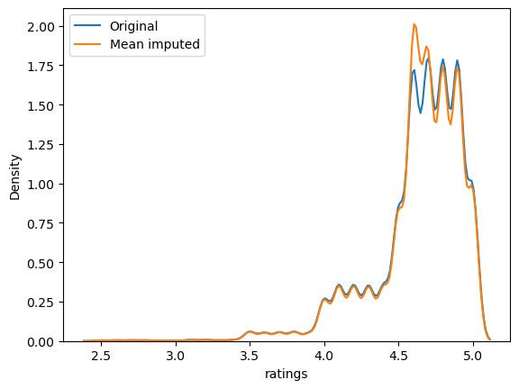
ratings before and after median imputation.Again, the distribution has changed.
weather
The count plot of the categories in weather is shown in Figure 66.
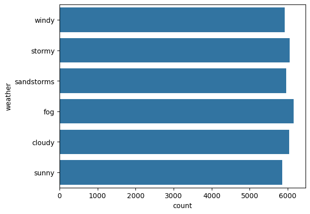
weather.No category in weather is dominating. Hence, we cannot impute using the most frequent (or mode) category. It will change the distribution significantly. So, we will instead use a missing indicator column and impute the missing values using the string "missing".
traffic
The count plot of the categories in traffic is shown in Figure 67.
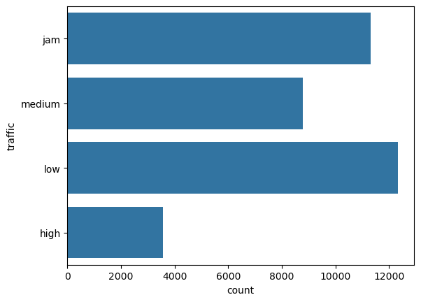
traffic.There are two traffic categories that are dominating, 'low' and 'jam'. Hence, we cannot use the most frequent category (or mode) imputation. So we will again have to use a missing indicator.
multiple_deliveries
The count plot of the categories in multiple_deliveries is shown in Figure 68.
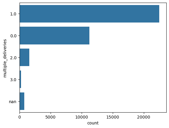
multiple_deliveries.multiple_deliveries has a clear dominating category. So, we can impute it using its mode. The count plot after imputation is shown in Figure 69.
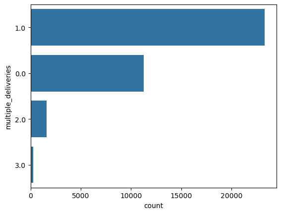
multiple_deliveries after mode imputation.festival
The count plot of the categories in festival is shown in Figure 70.
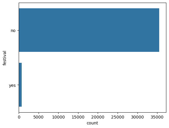
festival.festival has an overwhelmingly dominating category. Hence we can use mode imputation. The count plot after imputation stays almost the same.
city_type
The count plot of the categories in city_type is shown in Figure 71.
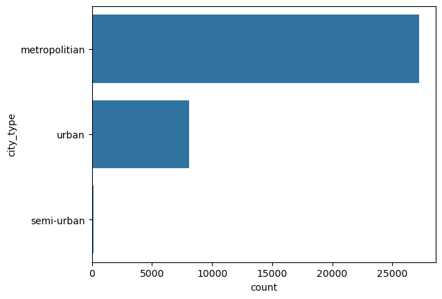
city_type.city_type has an overwhelmingly dominating category. Hence we can use mode imputation. The count plot after imputation stays almost the same.
pickup_time_minutes
The distribution of pickup_time_minutes before and after median imputation is shown in Figure 72.
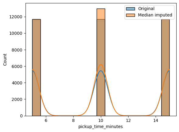
pickup_time_minutes before and after median imputation.The distribution has changed. We will need to use \(k\)-NN imputation.
order_time_of_day
The count plot of the categories in order_time_of_day is shown in Figure 73.
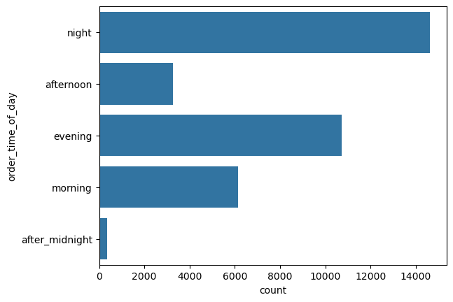
order_time_of_day.There is no category that is overwhelmingly dominating. So we will have to use a missing indicator column and a fill value of "missing".
distance
The distribution of distance before and after median imputation is shown in Figure 74.
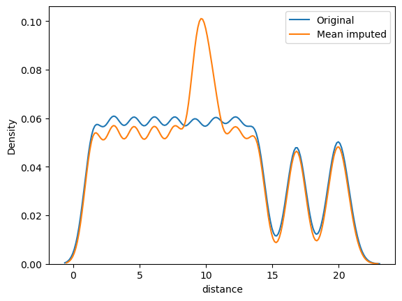
distance before and after median imputation.As the distribution has changed substantially, we should use advanced imputation methods.
distance_type
The count plot of the categories in distance_type is shown in Figure 75.
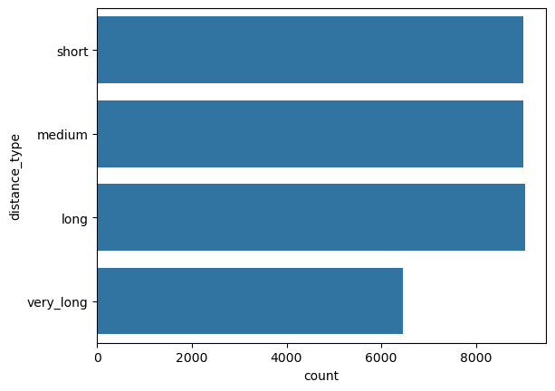
distance_type.There is no category that is overwhelmingly dominating. So we will have to use a missing indicator column and a fill value of "missing".
Creating a Model Pipeline
We will use mode imputation to fill the missing values in the columns
-
multiple_deliveries, -
festival, -
city_type,
and use a missing indicator with a fill value of "missing" in the columns
-
weather, -
type_of_order, -
type_of_vehicle, -
city_name, -
order_month, -
order_day_of_week, -
order_day_is_weekend, -
order_time_of_day,
and use \(k\)-NN imputation for the remaining columns. We will now create one more ColumnTransformer object for simple imputation (mode imputation and missing indicator).
simple_imputer = ColumnTransformer(
    transformers=[
        ("mode_imputer", SimpleImputer(strategy="most_frequent"), features_to_fill_mode),
        ("missing_ind", SimpleImputer(strategy="constant", fill_value="missing"), features_to_fill_missing_ind)
    ],
    remainder="passthrough",
    n_jobs=-1,
    force_int_remainder_cols=False,
    verbose_feature_names_out=False
)
Further, we will also create a KNNImputer object.
knn_imputer = KNNImputer(n_neighbors=5)
Next, we will combine all these transformers into a single scikit-learn Pipeline.
preprocessing_pipeline = Pipeline(
    steps=[
        ("simple_imputer", simple_imputer),
        ("preprocessor", preprocessor),
        ("knn_imputer", knn_imputer)
    ]
)
Finally, we will add this pipeline inside another pipeline that also consists of the linear regression model.
lr = LinearRegression()

model_pipeline = Pipeline(
    steps=[
        ("preprocessor", preprocessing_pipeline),
        ("model", lr)
    ]
)
The error metrics obtained on the data using this pipeline are shown in Table 8.
| Metric | Training Set | Test Set |
|---|---|---|
| MAE | 4.82 mins. | 4.85 mins. |
| R2 | 0.58 | 0.58 |
Table 8: Model performance metrics on training and test datasets with missing values imputed.
Comparing Table 7 and Table 8, we can see that dropping the missing values gives a model with better performance as compared imputing them.
Trying Random Forest Model in the Model Pipeline
We also tried random forest model in the pipeline with missing value imputation.
rf = RandomForestRegressor(random_state=42, n_jobs=-1)

model_pipeline = Pipeline(
    steps=[
        ("preprocessor", preprocessing_pipeline),
        ("model", rf)
    ]
)
The error metrics obtained on the data using this pipeline are shown in Table 9.
| Metric | Training Set | Test Set |
|---|---|---|
| MAE | 1.22 mins. | 3.28 mins. |
| R2 | 0.97 | 0.80 |
Table 9: Random Forest model performance metrics on training and test datasets with missing values imputed.
We can see that the random forest model performs way better than the baseline linear regression model. However, it also overfits more.
Jupyter Notebook
The baseline model was built in this Jupyter notebook.
Experimentation
We have used MLFlow to log experiments and their results. The tracking server is set up on DagsHub. The experiments we performed are the following:
- Compare a random forest model with imputing missing values vs. dropping missing values.
- Train a random forest model with missing value imputation and adding missing indicator columns.
- Train the following regressors and their parameters (using the Optuna library) on the best configuration obtained from the previous two experiments and select two best models:
- Random forest,
- Gradient boosting,
- XGBoost,
- LightGBM,
- \(k\)-Nearest neighbors,
- SVM.
- Carry out detailed hyperparameter tuning of the first model obtained in the previous experiment.
- Carry out detailed hyperparameter tuning of the second model obtained in the experiment 3.
- Train a stacking regressor, i.e., a meta estimator, using the two best models obtained in the previous two experiments as base estimators. We chose multiple meta estimators
- Carry out detailed hyperparameter tuning of the stacking regressor with the best meta estimator.
Let us now discuss the results of each experiment.
Experiment 1: Drop vs. Impute NaN’s
The results are shown in Table 10.
| Metric | Training Set (Dropped NaN's) | Test Set (Dropped NaN's) | Training Set (Imputed NaN's) | Test Set (Imputed NaN's) |
|---|---|---|---|---|
| MAE | 1.14 mins. | 3.12 mins. | 1.22 mins. | 3.28 mins. |
| R2 | 0.98 | 0.83 | 0.97 | 0.80 |
Table 10: Random Forest model performance comparison with missing values dropped vs. imputed.
The parallel coordinates plot obtained on MLFlow for this experiment is shown in Figure 76.
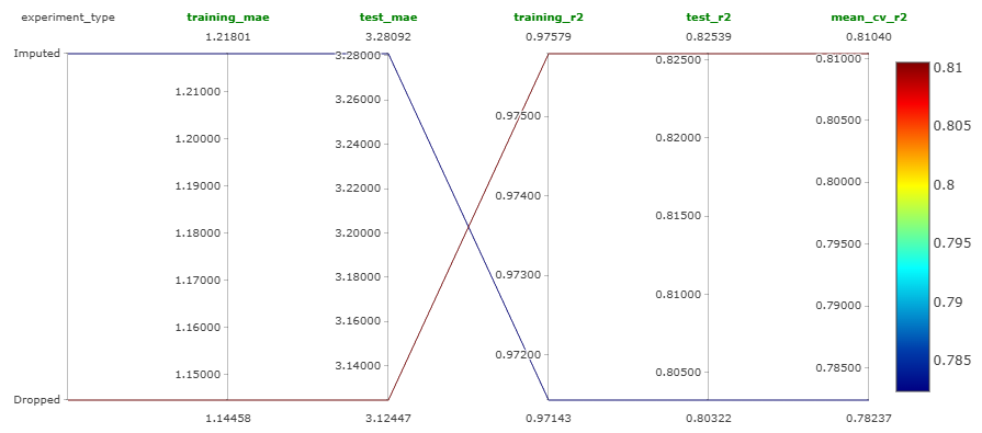
We can see that the model performs better when the missing values are dropped. However the common result is that the model is overfitting in both situations. But we now know that dropping the missing values is the way to go.
Jupyter Notebook
This experiment was performed in this Jupyter notebook.
Experiment 2: Adding Missing Indicator Columns
This is very simply done by adding the Boolean parameter of
add_indicator = True
inside the SimpleImputer object while defining it. The result obtained in this experiment are shown in Table 11.
| Metric | Training Set | Test Set |
|---|---|---|
| MAE | 1.21 mins. | 3.26 mins. |
| R2 | 0.97 | 0.81 |
Table 11: Random forest model performance metrics on training and test datasets with added missing indicator columns.
Comparing Table 10 and Table 11, we can see that adding missing indicator columns barely made any difference. Figure 77 shows the parallel coordinates plot that compares adding missing indicator columns vs. not adding them while imputing missing values.
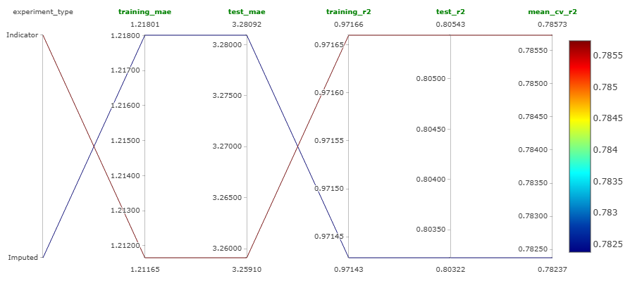
So, from experiments 1 and 2, we can conclude that dropping the missing values is the best strategy.
Jupyter Notebook
This experiment was performed in this Jupyter notebook.
Experiment 3: Model Selection
As mentioned before, we trained the following models:
- Random forest,
- Gradient boosting,
- XGBoost,
- LightGBM,
- \(k\)-Nearest neighbors,
- SVM,
using Optuna that carries out Bayesian optimization. The best performing model is LightGBM. The results are shown in Table 12.
| Metric | Training Set | Test Set |
|---|---|---|
| MAE | 2.82 mins. | 3.05 mins. |
| R2 | 0.86 | 0.84 |
Table 12: Model performance metrics on training and test datasets for the LightGBM model.
We can see that this model not only performs well on the test set as compared to random forest, but also has less overfitting. The second best model we got was random forest.
Jupyter Notebook
This experiment was performed in this Jupyter notebook.
Experiment 4: Detailed Hyperparameter Tuning of LightGBM
We carried detailed hyperparameter tuning of the LightGBM model using Optuna (Bayesian optimization). The hyperparameters we tuned are the following:
-
n_estimators, -
max_depth, -
learning_rate, -
subsample, -
min_child_weight, -
min_split_gain, -
reg_lambda.
Further, we also logged the best performing LightGBM model on MLFlow. The optimization history plot of this experiment is shown in Figure 78.
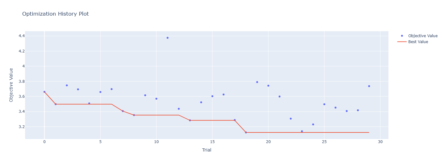
The hyperparameter importances plot is shown in Figure 79.
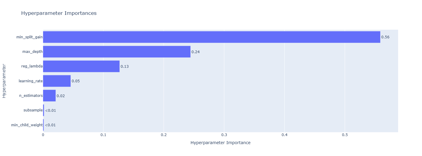
Jupyter Notebook
This experiment was performed in this Jupyter notebook.
Experiment 5: Detailed Hyperparameter Tuning of Random Forest
We carried detailed hyperparameter tuning of the random forest model using Optuna (Bayesian optimization). The hyperparameters we tuned are the following:
-
n_estimators, -
max_depth, -
max_features, -
min_samples_split, -
min_samples_leaf, -
max_samples.
Further, we also logged the best performing random forest model on MLFlow. The optimization history plot of this experiment is shown in Figure 80.
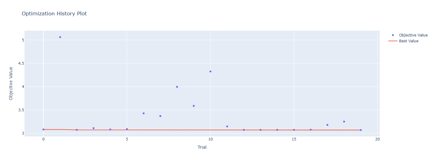
The hyperparameter importances plot is shown in Figure 81.
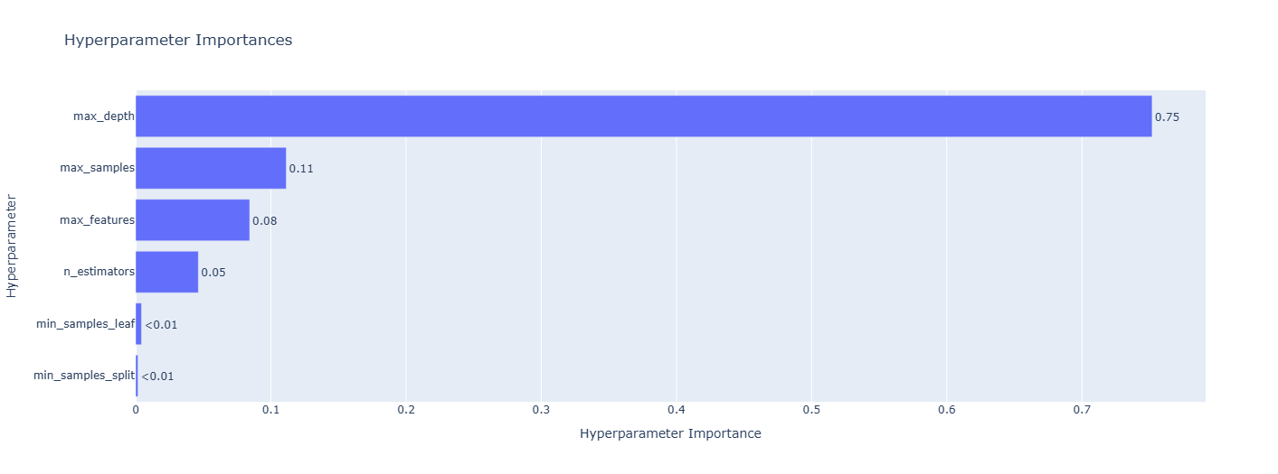
Jupyter Notebook
This experiment was performed in this Jupyter notebook.
Experiment 6: Meta Regressor
We tried three meta models: linear regression, \(k\)-nearest neighbors, and decision tree. The base estimators used were the best models that we got in the previous two experiments. This hyperparameter tuning to find the best meta model was also done using Optuna. This is just a basic coarse hyperparameter tuning. Detailed one is carried out in the next experiment. We found that the best meta model is linear regression.
Jupyter Notebook
This experiment was performed in this Jupyter notebook.
Experiment 7: Final Regressor
The best meta regressor found in the previous experiment was linear regression. As linear regression does not have any hyperparameters to tune, we created the final regressor in this experiment using base estimators as the best models found in experiments 4 and 5. We also logged this final regressor model on MLFlow.
Jupyter Notebook
This experiment was performed in this Jupyter notebook.
Building the DVC Pipeline
Let us discuss the stages that will be incorporated in the DVC pipeline. All these stages were implemented in complete modular fashion with classes and objects. Also, the DVC remote was set as an Amazon S3 bucket.
Stages in the DVC Pipeline
Data Cleaning
The functionality of this stage is almost the same as that of the clean_data function that we created when we cleaned the data before doing EDA. This stage does the following:
- Removes trailing spaces from each entry in the observations,
- Converts all the entries to lowercase,
- Replaces the string
"NaN"tonp.nan, - Renames columns to more succinct and meaningful names,
- Drops all the ID related columns,
- Drops all the rows corresponding to minors, i.e., riders below the age of 18,
- Drops all the rows corresponding to a rating of 6,
- Creates a new feature for the name of the city,
- Cleans location columns (latitude and longitude columns),
- Computes haversine distance using the location columns,
- Bins the distances,
- Cleans datetime columns,
- Cleans the
weathercolumn, - Converts the datatype of
multiple_deliveriescolumn tofloat - Transforms the target (
time_taken) using the Yeo-Johnson transformation, - Drops unnecessary columns.
Once all these steps are carried out, the cleaned data is saved. All these steps are implemented in the data_cleaning.py module, which can be checked out here.
Training-Test Split
This stage simply does the following:
- Loads the cleaned data that was saved after running the previous stage,
- Loads the parameters (from the
params.yamlfile) needed for creating the training-test split (e.g.,test_size,random_state), - Splits the cleaned data into training and test sets,
- Saves these sets.
All these steps are implemented in the training_test_split.py module, which can be checked out here.
Data Preprocessing
This stage carries out the following steps:
- Loads the training and test sets that were saved after running the previous stage,
- Drops missing values from both these sets,
- Forms the input-output (
X_train,y_train,X_test,y_test) split, - Creates a scikit-learn’s
ColumnTransformerobject containing steps for min-max scaling, and categorical encoding, - Trains this object on the training set,
- Transforms the training and test sets using the trained
ColumnTransformerobject, - Joins transformed
X_trainandy_trainto form the training data, and similarly forms the test data, - Saves the transformed training and test data,
- Saves the trained
ColumnTransformerobject.
All these steps are implemented in the data_preprocessing.py module, which can be checked out here.
Model Training
This stage carries out the following steps:
- Loads the transformed training data that was saved after running the previous stage,
- Forms the input-output (
X_train,y_train) split of this transformed training data, - Reads the tuned hyperparameters (from the
params.yaml) of both the models (LightGBM and random forest), - Creates a
StackingRegressormodel with linear regression as the meta estimator and the tuned LightGBM and tuned random forest as the base estimators, - Trains this
StackingRegressormodel and the Yeo-Johnson transformer on the training data, - Saves this trained model and the trained transformer.
All these steps are implemented in the model_training.py module, which can be checked out here.
Model Evaluation
This stage carries out the following steps:
- Loads the transformed training and test data that was saved after running the data preprocessing stage,
- Input-output splits them both (i.e., forms
X_train,y_train,X_test,y_test), - Loads the trained model that was saved after running the previous stage,
- Makes prediction on the
X_trainandX_test(i.e., gets the training and test predictions), - Compares the predictions with the ground truths and calculates the following metrics:
- Training MAE,
- Test MAE,
- Training \(R^2\),
- Test \(R^2\),
- Average of the cross-validated MAE.
- Logs the individual cross-validated MAE, data (training and test) as the input, model, and artifacts like the stacking regressor, preprocessor and the Yeo-Johnson transformer on MLFlow,
- Logs the information of the trained model in a JSON file. This file contains the ID, path, and the name of the model. Using this information, this model can be registered in MLFlow model registry (which is the next stage).
All these steps are implemented in the model_evaluation.py module, which can be checked out here.
Model Registration
This stage carries out the following steps:
- Loads the JSON file containing the information of the trained model which was saved after running the previous stage,
- Using this information, it registers the model on MLFlow model registry,
- Transition the stage of the model to “Staging”.
All these steps are implemented in the model_registration.py module, which can be checked out here.
dvc.yaml
All these stages in the DVC pipeline are connected through the dvc.yaml file, which can be checked out here. Running the following command in the terminal from the root directory (i.e., the directory where dvc.yaml file is present) will run this pipeline:
dvc repro
Building the API
The API is created using FastAPI. The steps carried out are the following:
- Cleans the data,
- Loads the JSON file containing the model information,
- Loads the preprocessor object,
- Loads the latest model,
- Builds a scikit-learn
Pipelinewith the preprocessor and the model, - Makes predictions using the pipeline.
The app has the following two endpoints:
-
"/": This is a basic welcome page. -
"/predict": This makes the predictions on the given data using the pipeline.
The code for this is in the app.py module, which can be checked out here. The API can be manually tested using the Swagger UI that is comes with FastAPI.
Locally Testing the API
The API was locally tested by creating a new Python script sample_predictions.py. This script loads a random row from the raw data and gives it as input to the "/predict" endpoint of the API and prints the ground truth and the prediction. This script can be checked out here.
Model Testing
The following tests are performed on the model:
- Model Loading:
- Testing whether the registered model is loading correctly.
- Model Performance:
- Testing whether the performance of this model is good.
Once the model passes both these tests, it will be promoted from the “Staging” stage to the “Production” stage. Later, we will include both these tests as a part of continuous integration (CI) using GitHub actions.
Model Loading
As mentioned earlier, this test makes sure that the registered model correctly loads from the MLFlow model registry. The following steps are carried out:
- Loads the JSON file containing the latest model information,
- Gets the latest model from the model registry using this information and a given stage,
- Performs a parameterized test that checks whether the registered model loads correctly.
The code for this is in the test_model_registration.py module inside the tests directory, which can be checked out here.
Model Performance
Again, as mentioned earlier, this test makes sure that the performance of the registered model is good. This is done by making sure that the test MAE is below a certain threshold. The steps carried out are the following:
- Loads the JSON file containing the latest model information,
- Gets the latest model from the model registry using this information and a given stage,
- Loads the preprocessor,
- Creates a scikit-learn
Pipelineusing the preprocessor and the loaded model, - Loads the test data,
- Makes predictions using the pipeline,
- Calculate the test MAE,
- Performs a parameterize test and check whether this test MAE is below the threshold (which is right now kept at 5 mins.).
The code for this is in the test_model_performance.py module inside the tests directory, which can be checked out here.
Continuous Integration (CI)
We automate the tests that are performed so far using CI on a GitHub runner using GitHub actions. This is done by creating a workflow file called ci_cd.yaml (the name can be anything) inside the workflows directory, which is in turn placed inside the .github directory of the project root. This workflow file consists of all the instructions that the GitHub runner follow to carry out these tests. Once all these tests are passed, we promote the model from the “Staging” stage to the “Production” stage. This promotion is done using the promote_model_to_production.py module, which can be checked out here.
The current content of the ci_cd.yaml workflow file is the following:
name: CI-CD

on: push

jobs:
  CI-CD:
    runs-on: ubuntu-latest
    steps:
      - name: Code checkout
        uses: actions/checkout@v4

      - name: Setup Python
        uses: actions/setup-python@v5
        with:
          python-version: '3.12'
          cache: 'pip'

      - name: Cache pip dependencies
        uses: actions/cache@v3
        with:
          path: ~/.cache/pip
          key: ${{ runner.os }}-pip-${{ hashFiles('**/requirements-dev.txt') }}
          restore-keys: |
            ${{ runner.os }}-pip-

      - name: Install packages
        run: |
          python -m pip install --upgrade pip
          pip install -r requirements-dev.txt

      - name: Configure AWS credentials
        uses: aws-actions/configure-aws-credentials@v4
        with:
          aws-access-key-id: ${{ secrets.AWS_ACCESS_KEY_ID }}
          aws-secret-access-key: ${{ secrets.AWS_SECRET_ACCESS_KEY }}
          aws-region: us-east-2

      - name: DVC pull
        run: |
          dvc pull

      - name: Test model registration
        env:
          DAGSHUB_USER_TOKEN: ${{ secrets.DAGSHUB_TOKEN }}
        run: |
          pytest tests/test_model_registration.py

      - name: Test model performance
        env:
          DAGSHUB_USER_TOKEN: ${{ secrets.DAGSHUB_TOKEN }}
        run: |
          pytest tests/test_model_performance.py

      - name: Promote model
        if: success()
        env:
          DAGSHUB_USER_TOKEN: ${{ secrets.DAGSHUB_TOKEN }}
        run: |
          python scripts/promote_model_to_production.py
The explanation is the following:
-
Workflow Name and Trigger
name: CI-CD on: push- Name: The workflow is named CI-CD.
- Trigger: It runs every time code is pushed to the repository.
-
Job Definition
jobs: CI-CD: runs-on: ubuntu-latest- Defines a single job also named
CI-CD. - This job will run on the latest Ubuntu runner provided by GitHub.
- Defines a single job also named
-
Step 1: Checkout Repository
- name: Code checkout uses: actions/checkout@v4- Checks out the latest version of the repository so the runner has access to your code.
-
Step 2: Set Up Python
- name: Setup Python uses: actions/setup-python@v5 with: python-version: '3.12' cache: 'pip'- Installs Python 3.12 on the runner.
- Enables caching for pip to speed up future runs.
-
Step 3: Cache pip Dependencies
- name: Cache pip dependencies uses: actions/cache@v3 with: path: ~/.cache/pip key: ${{ runner.os }}-pip-${{ hashFiles('**/requirements-dev.txt') }} restore-keys: | ${{ runner.os }}-pip-- Uses caching to store downloaded Python packages between workflow runs.
- This reduces time and bandwidth if
requirements-dev.txthasn’t changed.
-
Step 4: Install Python Packages
- name: Install packages run: | python -m pip install --upgrade pip pip install -r requirements-dev.txt- Upgrades pip to the latest version.
- Installs all the development dependencies listed in
requirements-dev.txt.
-
Step 5: Configure AWS Credentials
- name: Configure AWS credentials uses: aws-actions/configure-aws-credentials@v4 with: aws-access-key-id: ${{ secrets.AWS_ACCESS_KEY_ID }} aws-secret-access-key: ${{ secrets.AWS_SECRET_ACCESS_KEY }} aws-region: us-east-2- Uses GitHub secrets to authenticate with AWS.
- Enables access to AWS services like S3 or ECR (used by DVC in this case).
-
Step 6: Pull Data and Models using DVC
- name: DVC pull run: | dvc pull- Runs
dvc pullto download data, models, or other tracked artifacts from DVC remote storage.
- Runs
-
Step 7: Test Model Registration
- name: Test model registration env: DAGSHUB_USER_TOKEN: ${{ secrets.DAGSHUB_TOKEN }} run: | pytest tests/test_model_registration.py- Runs the test located in
tests/test_model_registration.py. - This tests verifies whether the model loads successfully from the model registry.
- Uses a DagsHub token for authenticated interaction.
- Runs the test located in
-
Step 8: Test Model Performance
- name: Test model performance env: DAGSHUB_USER_TOKEN: ${{ secrets.DAGSHUB_TOKEN }} run: | pytest tests/test_model_performance.py- Runs the test located in
tests/test_model_performance.py. - This test verifies that the performance of the model is good.
- Runs the test located in
-
Step 9: Promote Model to Production
- name: Promote model if: success() env: DAGSHUB_USER_TOKEN: ${{ secrets.DAGSHUB_TOKEN }} run: | python scripts/promote_model_to_production.py- If all previous steps succeed, the script
promote_model_to_production.pyis executed. - It promotes the model to production stage.
- If all previous steps succeed, the script
Containerizing the API using Docker
🚧 Work in Progress: This page is currently being written. Some sections are complete, while others are still under construction. Feel free to explore and check back later for updates!